Visualization - Python
Quote
“The greatest value of a picture is when it forces us to notice what we never expected to see.”
— John Tukey, Exploratory Data Analysis (1977)
Summary
Covers DataFrame visualization end to end on real EuroStoxx data, moving from static explanatory charts in Matplotlib and Seaborn to browser-native interactive views in Bokeh and Plotly, with emphasis on choosing the right library, exporting the result correctly, and avoiding performance or publishing traps.
Data Preparation / Matplotlib / Seaborn
- Prepare reusable plotting subsets, apply the Tokyo Night Matplotlib theme, and build static line, bar, scatter, area, pie, donut, and dual-axis charts for explanation-focused reporting
- Use Seaborn for fast statistical views such as distributions, heatmaps, and categorical comparisons, while retaining Matplotlib-level control for styling and layout
Bokeh — Interactive Charts
- Build browser-native interactive charts including candlesticks, line and bar charts, scatter plots, distributions, heatmaps, linked brushing layouts, dashboards, and exportable HTML widgets
- Use hover tools, selections, layouts, and server-style patterns where notebook interactivity is more important than static publication
Plotly — Interactive Charts
- Build interactive line, bar, scatter, histogram, area, pie, sunburst, treemap, heatmap, candlestick, OHLC, geographic, animated, and dashboard-style charts
- Contrast Plotly Express for fast high-level plotting with Graph Objects for lower-level control, dropdowns, subplots, templates, and custom hover behavior
- Show Polars integration and explicit list conversion for cases where Graph Objects do not accept DataFrame-native inputs directly
Operations and safety
- When to use each library: Matplotlib for reproducible static publication, Seaborn for quick statistical EDA, Bokeh for linked interactive exploration and dashboards, Plotly for rich interactive financial and notebook-friendly charts
- When not to use: million-point browser scatterplots, notebook charts for real-time streaming dashboards, interactive-only visuals in CI/PDF workflows, or these libraries as substitutes for dedicated geospatial tooling
- Warnings: Plotly HTML output can embed multi-megabyte JavaScript payloads, Bokeh/Plotly widgets do not render everywhere in Quartz/Obsidian contexts, and color-scale choice can invert or hide analytical meaning
- Recommendations: 5 practices covering Tokyo Night for vault publication, Plotly Express for fast EDA, Bokeh for linked exploration, dual HTML/PNG export, and aggressive downsampling before plotting large data
- Troubleshooting: 6 failure modes covering blank Matplotlib notebooks, mismatched Bokeh source fields, Plotly renderer issues, unreadable heatmap labels, oversized HTML exports, and dark-theme-invisible default colors
Glossary
Matplotlib
The foundational Python plotting library used for low-level, highly controllable static visualizations.
It matters because the note uses it as the base layer for publication-style charts, custom theming, and the styling model underneath Seaborn.
Static-first strength
Matplotlib is often the best choice when the output must survive notebooks, CI exports, PDFs, and static publishing without JavaScript dependencies.
Seaborn
A high-level statistical visualization layer built on top of Matplotlib with strong defaults for common analytical chart types.
It matters because the note uses it for fast distribution, correlation, and category comparisons without hand-building every axis from scratch.
Still a Matplotlib ecosystem tool
Seaborn simplifies chart creation, but non-trivial customization still often falls back to Matplotlib axes and figure APIs.
Bokeh
A Python visualization library that renders interactive charts as HTML and JavaScript rather than static image objects.
It matters because the note uses Bokeh where linked brushing, hover interactions, and dashboard-style layouts provide analytical value beyond static figures.
HTML widget, not image
Bokeh output is interactive web content. If the target environment cannot render embedded HTML/JS widgets reliably, you need a static fallback.
Plotly
An interactive charting library backed by Plotly.js, spanning quick notebook charts through highly customized dashboard-style figures.
It matters because the note uses Plotly for financial visuals, templates, interactivity, and exportable HTML artifacts.
Interactivity has payload cost
Plotly charts are easy to share, but the JavaScript bundle and figure JSON can make output files much larger than static chart images.
Candlestick chart
A financial chart type that encodes open, high, low, and close values for each time interval using bodies and wicks.
It matters because the note uses candlesticks as the standard interactive price-action view for OHLCV market data.
Column mapping must be exact
Candlestick charts depend on correctly identified OHLC columns. Misordered or mislabeled inputs can render misleading price action or fail silently.
Heatmap
A grid visualization where color intensity encodes numeric magnitude across a matrix of values.
It matters because the note uses heatmaps for correlations and other dense two-dimensional numeric summaries.
Color semantics are analytical semantics
Sequential and diverging palettes communicate different meanings. Pick the scale to match whether magnitude-only or signed deviation is the real story.
Facet / subplot
A layout pattern that splits one comparison across multiple smaller axes, one panel per category or view.
It matters because many comparisons in the note become readable only when overplotting is replaced by small multiples.
Too many panels destroy legibility
Faceting solves overlap only up to a point. Once the grid becomes too dense, aggregation or filtering is usually a better design choice.
Linked brushing
An interaction pattern where selections in one chart automatically highlight the corresponding records in another chart.
It matters because Bokeh examples in the note rely on linked interaction to connect overview and detail views.
Powerful for exploratory dashboards
Linked brushing is most useful when multiple coordinated views show different projections of the same underlying records.
ColumnDataSource
Bokeh’s tabular data container that maps named fields to sequences used by glyphs, tools, and linked selections.
It matters because most non-trivial Bokeh charts in the note depend on consistent field naming between the source and the plotted glyph properties.
Field names must match exactly
A glyph referencing a missing field will render incorrectly or not at all. Data source schema and glyph configuration must stay aligned.
Plotly Express
Plotly’s high-level API for constructing common interactive charts quickly from DataFrames with minimal code.
It matters because the note treats it as the fastest route to exploratory visualizations and Polars-friendly plotting.
Best default for quick interactive EDA
When the chart type is standard and the interaction needs are modest, Plotly Express usually gets you there faster than building a figure manually.
Graph Objects /
go.Figure
Plotly’s lower-level API for assembling figures explicitly from trace objects, layouts, and interactive controls.
It matters because the note uses Graph Objects when Express is too limited for candlesticks, custom subplots, or advanced interactivity.
More control means more boilerplate
Graph Objects are powerful precisely because they are explicit. Expect more code and more manual wiring than in Plotly Express.
Static export
Saving a chart as a non-interactive asset such as PNG, SVG, or PDF.
It matters because vault publishing, reports, CI artifacts, and long-term documentation often need renderer-independent output.
Interactive tools still need static fallbacks
A chart that works in a notebook may fail in a static site or PDF pipeline. Exporting a static image protects the content from environment-specific widget failures.
HTML export
Saving an interactive chart as a standalone HTML document or embeddable widget for browser-based viewing.
It matters because both Bokeh and Plotly examples in the note are designed to be shared or embedded outside the notebook runtime.
Size and compatibility vary
HTML export preserves interactivity, but file size, CSP rules, CDN availability, and static-site rendering support all affect whether the result is practical to publish.
from cycler import cycler
import pandas as pd
import polars as pl
import polars.selectors as cs
import numpy as np
import matplotlib.pyplot as plt
import seaborn as sns
from pathlib import Path

from IPython.display import display, Markdown
html_formatter = get_ipython().display_formatter.formatters['text/html'] # type: ignore
html_formatter.for_type(pd.DataFrame, lambda df: df.to_html())
html_formatter.for_type(pd.Series, lambda s: s.to_frame().to_html())

pl.Config.set_tbl_rows(100)
pd.set_option("display.max_rows", 100)

DATA = Path("../data")

# Core datasets
ohlcv_pd = pd.read_parquet(DATA / "eurostoxx50_ohlcv.parquet")  # 66K rows, daily OHLCV
ohlcv_pl = pl.read_parquet(DATA / "eurostoxx50_ohlcv.parquet")
dim_pd = pd.read_parquet(DATA / "index_dim.parquet")            # 169 rows, stock metadata
dim_pl = pl.read_parquet(DATA / "index_dim.parquet")
scores_pd = pd.read_parquet(DATA / "scores_daily.parquet")      # 466 rows, composite scores
scores_pl = pl.read_parquet(DATA / "scores_daily.parquet")

print(f"OHLCV: {ohlcv_pd.shape}, Dim: {dim_pd.shape}, Scores: {scores_pd.shape}")

import tempfile
TMP = Path(tempfile.mkdtemp())

# Tokyo Night theme for Matplotlib
plt.rcParams.update({
    "figure.facecolor": "#1a1b26",
    "axes.facecolor": "#1a1b26",
    "axes.edgecolor": "#3b4261",
    "axes.labelcolor": "#a9b1d6",
    "axes.prop_cycle": cycler(color=["#7aa2f7", "#9ece6a", "#e0af68", "#f7768e", "#bb9af7", "#7dcfff", "#73daca", "#ff9e64"]),
    "text.color": "#a9b1d6",
    "xtick.color": "#a9b1d6",
    "ytick.color": "#a9b1d6",
    "grid.color": "#292e42",
    "legend.facecolor": "#24283b",
    "legend.edgecolor": "#3b4261",
    "legend.labelcolor": "#a9b1d6",
    "savefig.facecolor": "#1a1b26",
})

from matplotlib.patches import Circle
import plotly.io as pio
import plotly.express as px
import plotly.graph_objects as go
from plotly.subplots import make_subplots
from IPython.display import HTML
OHLCV: (66355, 12), Dim: (169, 26), Scores: (466, 36)
Data Preparation
Reusable Subsets
# Reusable subsets for plotting
asml = ohlcv_pd[ohlcv_pd["symbol"] == "ASML.AS"].sort_values("date").tail(365).copy()
top5_syms = ["ASML.AS", "SAP.DE", "SIE.DE", "TTE.PA", "AIR.PA"]
top5 = ohlcv_pd[ohlcv_pd["symbol"].isin(top5_syms)].sort_values("date").copy()
sector_avg = scores_pd.groupby("sector")["composite_score"].mean().sort_values()
Line Charts
Line charts connect data points in order, revealing trends, cycles, and rate of change over time. Slope shows velocity; curvature shows acceleration; crossings between series highlight regime changes.
Best for: Time-series data, continuous measurements over ordered intervals (stock prices, sensor readings, revenue over months). Not suitable for unordered categories.
Basic Line
Pandas | Basic line
Plots ASML’s 365-day close price series using DataFrame.plot(x="date", y="close") — Pandas delegates directly to Matplotlib, producing a single-call line chart with axis labels and a tight layout.
# Close price evolution for ASML over the last year
asml.plot(x="date", y="close", title="ASML Close Price (1Y)", figsize=(10, 4), legend=False)
plt.ylabel("Close")
plt.tight_layout()
plt.show()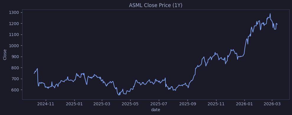
Multi-series Line
Matplotlib | Multi-series line
Loops over top5_syms and plots each stock’s close price on the same axes with ax.plot(), producing five independently colored lines on a shared date axis — each labeled for legend identification.
# Close price comparison for 5 stocks on the same time axis
fig, ax = plt.subplots(figsize=(10, 5))
for sym in top5_syms:
    df = top5[top5["symbol"] == sym]
    ax.plot(df["date"], df["close"], label=sym)
ax.set_title("Close Prices — Top 5")
ax.legend()
plt.tight_layout()
plt.show()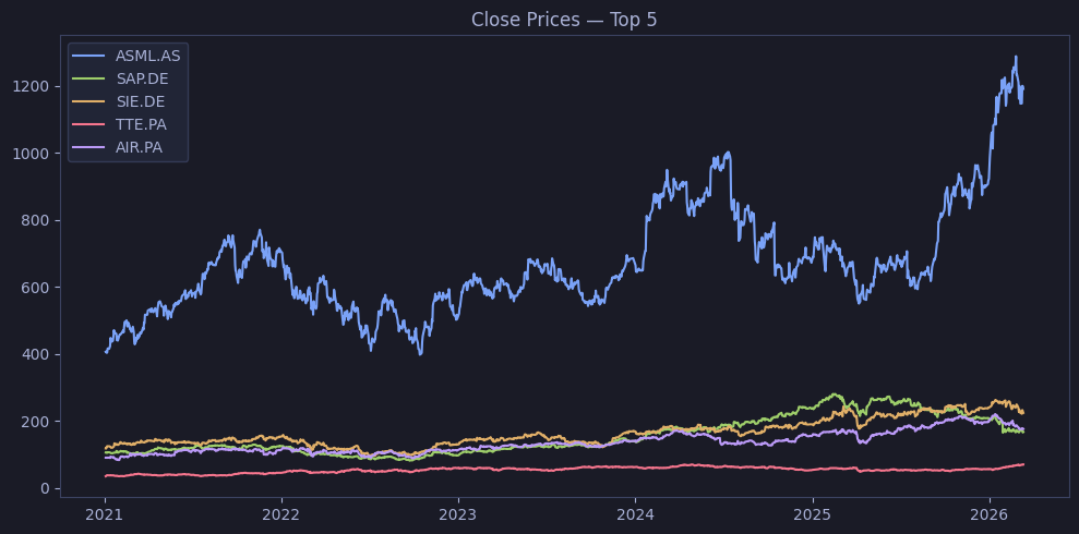
Line Styles and Markers
Matplotlib | Line styles & markers
Overlays ASML’s close (solid blue) and open (dashed orange) prices, then adds red circle markers at every 30th row using .iloc[::30] to indicate approximate monthly reference points.
# Close vs Open price with different line styles and monthly markers
fig, ax = plt.subplots(figsize=(10, 4))
ax.plot(asml["date"], asml["close"], color="#7aa2f7", linewidth=2, label="Close")
ax.plot(asml["date"], asml["open"], color="#e0af68", linewidth=1, linestyle="--", label="Open")
ax.plot(asml["date"].iloc[::30], asml["close"].iloc[::30], "o",
        color="#f7768e", markersize=6, label="Monthly mark")
ax.set_title("Line Styles & Markers")
ax.legend()
plt.tight_layout()
plt.show()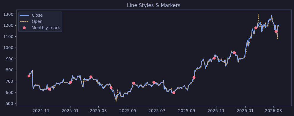
Fill Between
Matplotlib | Fill between
Traces ASML’s close price as a line and shades the gap between low and high using fill_between() with alpha=0.2, visualizing daily volatility as a blue band around the close.
# Close price with shaded high-low range showing daily volatility
fig, ax = plt.subplots(figsize=(10, 4))
ax.plot(asml["date"], asml["close"], color="#7aa2f7")
ax.fill_between(asml["date"], asml["low"], asml["high"], alpha=0.2, color="#7aa2f7", label="High-Low range")
ax.set_title("ASML: Close with High-Low Band")
ax.legend()
plt.tight_layout()
plt.show()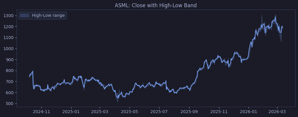
Dual Y-axis
Matplotlib | Dual y-axis
Creates a twin axes with twinx() — ASML close price traces on the left y-axis in blue, and daily volume bars overlay on the right y-axis in green with alpha=0.3, sharing the same date x-axis.
# Price on left axis, volume bars on right axis — shows if volume spikes align with price moves
fig, ax1 = plt.subplots(figsize=(10, 4))
ax1.plot(asml["date"], asml["close"], color="#7aa2f7", label="Close")
ax1.set_ylabel("Close", color="#7aa2f7")

ax2 = ax1.twinx()
ax2.bar(asml["date"], asml["volume"], alpha=0.3, color="#9ece6a", label="Volume")
ax2.set_ylabel("Volume", color="#9ece6a")

ax1.set_title("ASML: Price & Volume")
fig.tight_layout()
plt.show()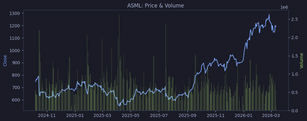
Bar Charts
Bar charts compare discrete categories by encoding values as bar lengths. Horizontal bars work better when category labels are long. Grouped bars compare sub-categories side by side; stacked bars show part-to-whole composition.
Best for: Categorical comparisons (revenue by department, scores by sector, counts by group). Use when you have a small-to-medium number of categories (<20). For many categories, consider sorting or filtering.
Horizontal Bar
Pandas | Horizontal bar
Renders the pre-computed sector_avg Series as a horizontal bar chart using .plot.barh() — sectors are already sorted by ascending mean score, so the shortest bar is at the bottom and the longest at the top.
# Horizontal ranking of sectors by average composite score
sector_avg.plot.barh(title="Avg Composite Score by Sector", figsize=(10, 5))
plt.xlabel("Score")
plt.tight_layout()
plt.show()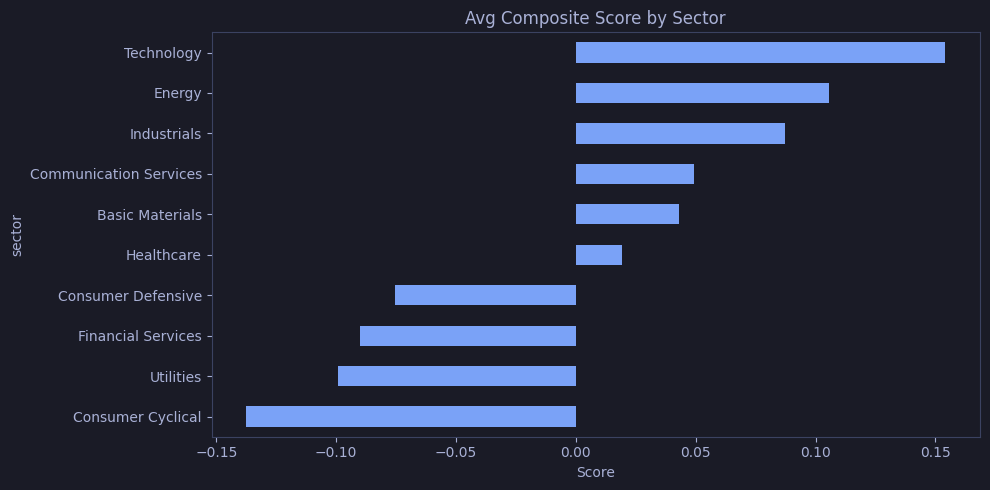
Vertical Bar
Pandas | Vertical bar
Reuses the same sector_avg Series with .plot.bar() for vertical bars, rotating x-tick labels 45° with ha="right" to prevent overlap of sector names.
# Same ranking as vertical bars (easier axis labels when few categories)
sector_avg.plot.bar(title="Avg Composite Score by Sector", figsize=(10, 5))
plt.ylabel("Score")
plt.xticks(rotation=45, ha="right")
plt.tight_layout()
plt.show()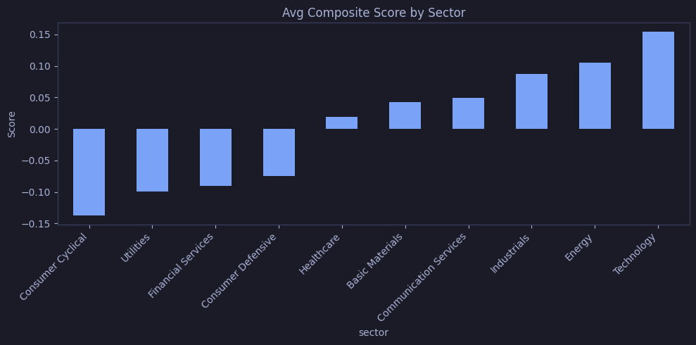
Grouped Bar
Pandas | Grouped bar
Aggregates momentum_score and relative_value_score per sector, then calls .plot.bar() on the resulting DataFrame — Pandas places the two metrics side by side for each sector automatically.
# Side-by-side comparison of momentum and value scores per sector
agg = scores_pd.groupby("sector")[["momentum_score", "relative_value_score"]].mean()
agg.plot.bar(figsize=(10, 5), title="Momentum vs Value by Sector")
plt.ylabel("Score")
plt.xticks(rotation=45, ha="right")
plt.legend(title="Metric")
plt.tight_layout()
plt.show()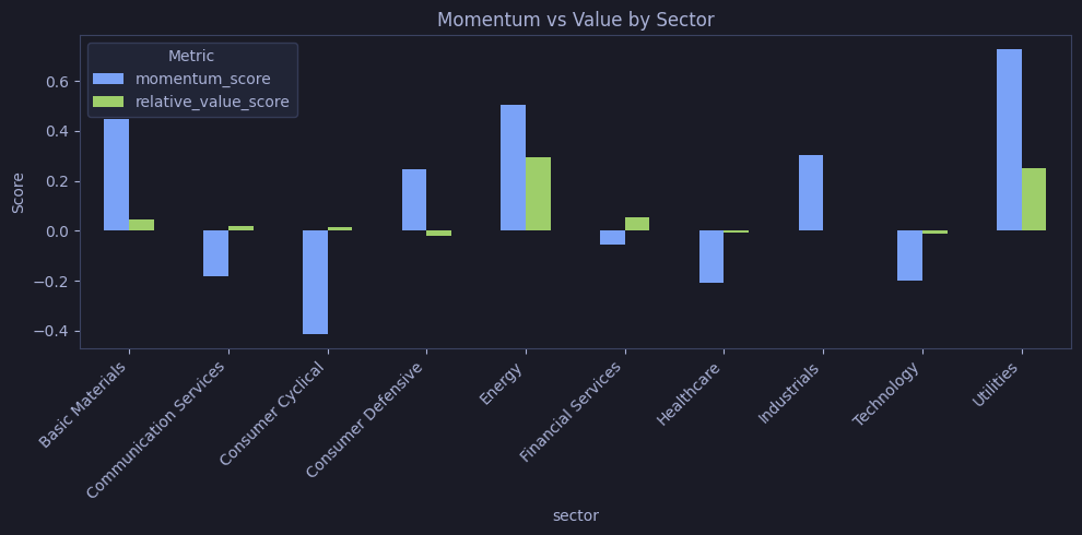
Stacked Bar
Pandas | Stacked bar
Calls .plot.bar(stacked=True) on the same per-sector aggregation — the two score bars are stacked vertically per sector, so total bar height represents the combined momentum + value score.
# Stacked view: total score magnitude per sector, split by metric
agg.plot.bar(stacked=True, figsize=(10, 5), title="Momentum + Value Stacked")
plt.ylabel("Score")
plt.xticks(rotation=45, ha="right")
plt.tight_layout()
plt.show()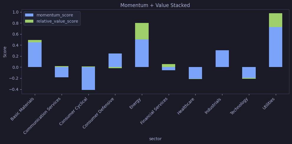
Bar with Error Bars
Pandas | Bar with error bars
Computes mean and standard deviation of composite_score per sector via .agg(["mean", "std"]), then renders horizontal bars with xerr=stats["std"] — cap-ended whiskers show ±1 std dev per sector.
# Mean composite score per sector with standard deviation error bars showing dispersion
stats = scores_pd.groupby("sector")["composite_score"].agg(["mean", "std"])
fig, ax = plt.subplots(figsize=(10, 5))
stats["mean"].plot.barh(xerr=stats["std"], ax=ax, capsize=4, title="Score ± Std Dev")
plt.xlabel("Composite Score")
plt.tight_layout()
plt.show()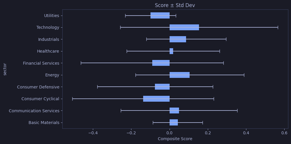
Histograms
Histograms bin continuous data to show its distribution shape — normal, skewed, bimodal, etc. Bin count matters: too few hides structure, too many adds noise. KDE (kernel density estimation) overlays a smooth curve estimate of the probability density.
Best for: Exploring a single continuous variable (prices, returns, test scores). Answers: “What is the typical range? Are there outliers? Is the data symmetric?”
Basic Histogram
Pandas | Basic histogram
Bins all 66K close price values from ohlcv_pd into 50 buckets using .plot.hist(bins=50) — the resulting distribution shows the price concentration across all EuroStoxx 50 stocks and years.
# Distribution of all close prices across all stocks — reveals price clustering and outliers
ohlcv_pd["close"].plot.hist(bins=50, title="Distribution of Close Prices", figsize=(10, 4))
plt.xlabel("Close Price")
plt.tight_layout()
plt.show()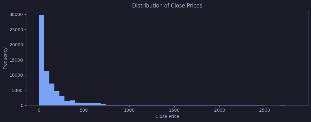
Overlaid Histograms
Matplotlib | Overlaid histograms
Plots three overlapping histograms (ASML, SAP, SIE close prices) on shared axes using alpha=0.5 per histogram — where bars overlap, blended colors reveal which price ranges these stocks share.
# Overlaid histograms to compare price distributions of 3 stocks
fig, ax = plt.subplots(figsize=(10, 4))
for sym in ["ASML.AS", "SAP.DE", "SIE.DE"]:
    ohlcv_pd[ohlcv_pd["symbol"] == sym]["close"].plot.hist(
        bins=40, alpha=0.5, label=sym, ax=ax)
ax.set_title("Close Price Distribution (Overlaid)")
ax.legend()
plt.tight_layout()
plt.show()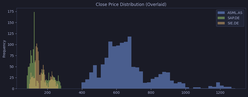
Histogram + KDE
Pandas | Histogram + KDE
Normalizes ASML’s close price histogram with density=True and overlays plot.kde() on the same axes — the KDE line smooths the distribution shape, showing that prices cluster around a central mode with a light right skew.
# ASML price histogram with KDE overlay showing the smooth probability density
fig, ax = plt.subplots(figsize=(10, 4))
asml["close"].plot.hist(bins=30, density=True, alpha=0.6, ax=ax, label="Histogram")
asml["close"].plot.kde(ax=ax, color="#f7768e", linewidth=2, label="KDE")
ax.set_title("ASML Close: Histogram + KDE")
ax.legend()
plt.tight_layout()
plt.show()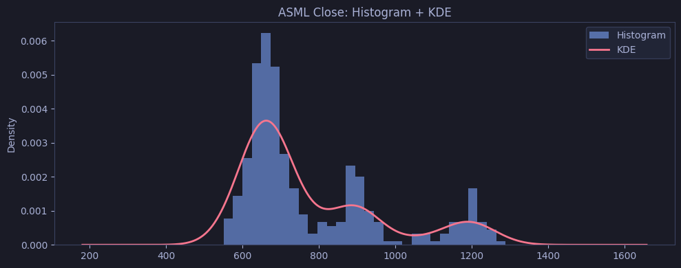
2D Hexbin Histogram
Matplotlib | 2D hexbin histogram
Bins all (momentum, value) score pairs into a 20×20 hexagonal grid using ax.hexbin(gridsize=20) and maps count to a YlOrRd color scale — the darkest hex cells reveal where most stocks cluster in 2D score space.
# 2D density of momentum vs value scores — reveals where most stocks cluster
fig, ax = plt.subplots(figsize=(8, 6))
hb = ax.hexbin(scores_pd["momentum_score"], scores_pd["relative_value_score"],
               gridsize=20, cmap="YlOrRd")
plt.colorbar(hb, ax=ax, label="Count")
ax.set_xlabel("Momentum Score")
ax.set_ylabel("Relative Value Score")
ax.set_title("2D Hexbin: Momentum vs Value")
plt.tight_layout()
plt.show()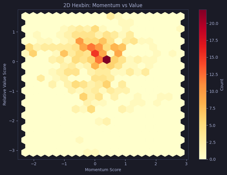
Scatter Plots
Scatter plots reveal relationships between two continuous variables — correlation, clusters, and outliers. Adding color encodes a third variable (categorical or continuous); size encodes a fourth (bubble chart). No visible pattern = no linear relationship, but non-linear patterns may still exist.
Best for: Exploring correlation between two numeric columns (price vs volume, momentum vs value). Works well up to ~10K points; beyond that, use hexbin or density plots to avoid overplotting.
Basic Scatter
Pandas | Basic scatter
Calls .plot.scatter(x="momentum_score", y="relative_value_score") on scores_pd, rendering all 466 stock–date observations as semi-transparent dots with alpha=0.5 to expose overlap density.
# Relationship between momentum and relative value scores across all stocks
scores_pd.plot.scatter(x="momentum_score", y="relative_value_score",
                       alpha=0.5, title="Momentum vs Value", figsize=(8, 6))
plt.tight_layout()
plt.show()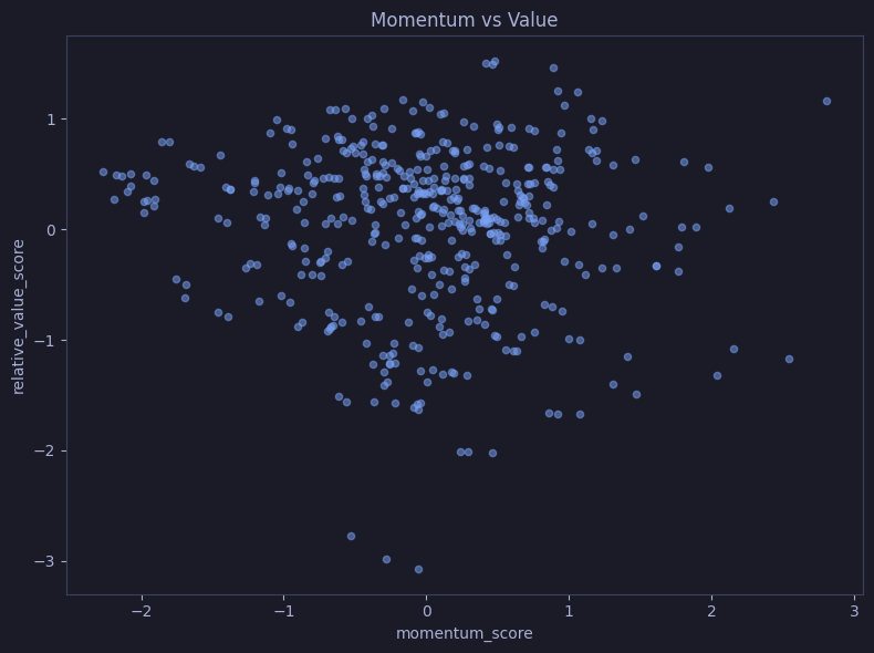
Color-mapped Scatter
Matplotlib | Color-mapped scatter
Maps composite_score to the coolwarm diverging colormap via ax.scatter(c=scores_pd["composite_score"]) — warm tones identify stocks with high composite scores; cool tones identify low scorers in the momentum × value space.
# Same scatter, color-mapped by composite score to reveal which quadrant has highest scores
fig, ax = plt.subplots(figsize=(8, 6))
sc = ax.scatter(scores_pd["momentum_score"], scores_pd["relative_value_score"],
                c=scores_pd["composite_score"], cmap="coolwarm", alpha=0.7, edgecolors="none")
plt.colorbar(sc, ax=ax, label="Composite Score")
ax.set_xlabel("Momentum")
ax.set_ylabel("Relative Value")
ax.set_title("Scatter colored by Composite Score")
plt.tight_layout()
plt.show()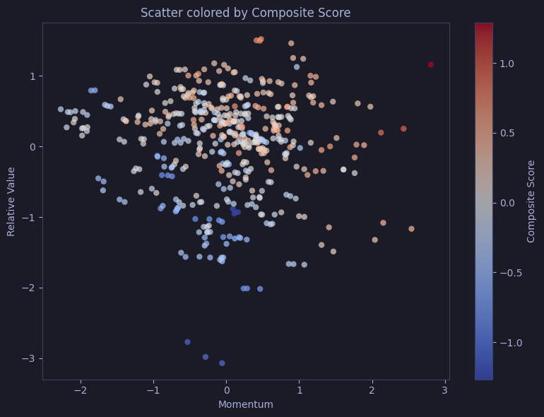
Bubble Chart
Matplotlib | Bubble chart (size + color)
Normalizes composite_score to positive bubble sizes (sizes) and passes both s=sizes and c=scores_pd["composite_score"] to ax.scatter() — each stock appears as a bubble where area and hue simultaneously encode the same score magnitude.
# Bubble chart: position = momentum vs value, size & color = composite score magnitude
fig, ax = plt.subplots(figsize=(8, 6))
# Normalize composite_score to positive sizes
sizes = (scores_pd["composite_score"] - scores_pd["composite_score"].min() + 0.1) * 100
sc = ax.scatter(scores_pd["momentum_score"], scores_pd["relative_value_score"],
                s=sizes, c=scores_pd["composite_score"], cmap="viridis",
                alpha=0.6, edgecolors="#3b4261", linewidth=0.5)
plt.colorbar(sc, ax=ax, label="Composite Score")
ax.set_title("Bubble Chart: size & color = composite score")
plt.tight_layout()
plt.show()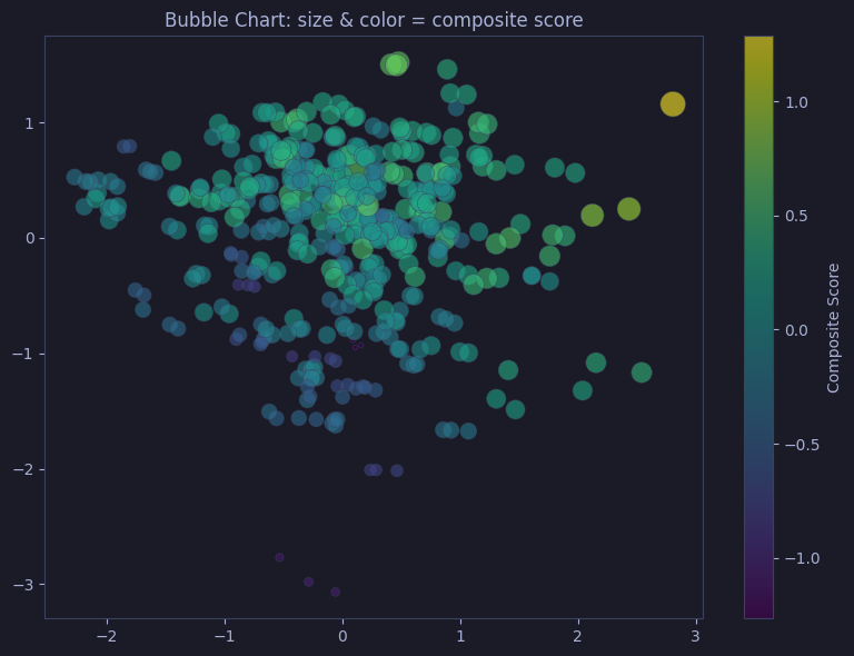
Area Charts
Area charts are line charts with the region below filled, emphasizing magnitude and cumulative totals. Stacked areas show how components contribute to a total over time.
Best for: Time-series composition data (market share over time, portfolio allocation, traffic sources). Keep to 3–5 series; too many layers become unreadable.
Basic Area
Pandas | Basic area
Calls .plot.area(x="date", y="close", alpha=0.4) on the ASML subset — the filled region from zero to close emphasizes cumulative magnitude and makes price level immediately visible.
# ASML close price as filled area — emphasizes magnitude relative to zero
asml.plot.area(x="date", y="close", alpha=0.4, title="ASML Close (Area)", figsize=(10, 4), legend=False)
plt.ylabel("Close")
plt.tight_layout()
plt.show()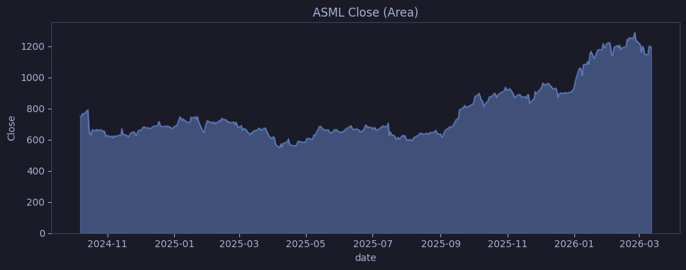
Stacked Area
Pandas | Stacked area
Pivots ASML, SAP, and SIE daily volume into a wide DataFrame (rows = dates, cols = symbols), then calls .plot.area(alpha=0.6) — the three layers stack so total area height represents combined daily volume across the three stocks.
# Pivot daily volume for top 3 stocks
vol_pivot = top5[top5["symbol"].isin(top5_syms[:3])].pivot_table(
    index="date", columns="symbol", values="volume", aggfunc="sum")
vol_pivot.plot.area(figsize=(10, 5), alpha=0.6, title="Stacked Volume (Top 3)")
plt.ylabel("Volume")
plt.tight_layout()
plt.show()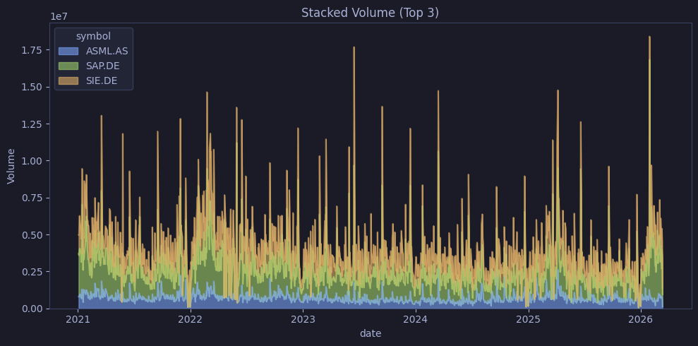
Pie & Donut
Pie charts show part-to-whole proportions for a single categorical variable. Humans judge angles poorly, so pie charts work best with ≤6 slices and clear size differences. Donut charts free the center for labels or KPIs.
Best for: Showing composition when there are few categories with distinct proportions (market share, budget allocation). For precise comparison or many categories, prefer bar charts.
Pie Chart
Matplotlib | Pie chart
Groups dim_pd by sector, computes counts, and builds label strings as "name\ncount (pct%)" — ax.pie() renders each sector as a colored slice with the pre-computed label embedded.
# Proportion of stocks in each sector within the EuroStoxx 50 index
sector_count = dim_pd.groupby("sector").size()
total = sector_count.sum()
fig, ax = plt.subplots(figsize=(8, 8))
NL = chr(10)
labels = [f"{name}{NL}{count} ({count/total*100:.0f}%)" for name, count in zip(sector_count.index, sector_count)]
colors = ["#1a3a5c", "#2d4a3e", "#5c4a1a", "#5c1a2a", "#3a2a5c",
          "#1a4a5c", "#1a5c4a", "#5c3a1a", "#1a4a4a", "#2a3a4a",
          "#3b4261", "#292e42"]
ax.pie(sector_count.tolist(), labels=labels, startangle=90,
       colors=colors[:len(sector_count)])
ax.set_title("Stocks per Sector")
plt.tight_layout()
plt.show()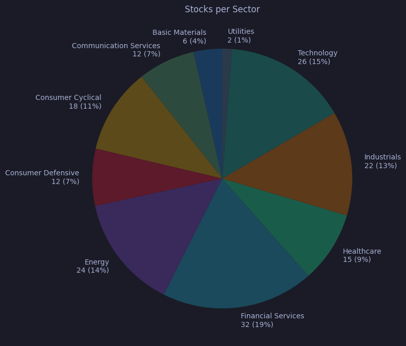
Donut Chart
Matplotlib | Donut chart
Renders the same sector proportions as a pie, then adds a Circle patch at radius 0.60 with the background color to punch out a donut hole — the center space can display a total count or KPI label.
# Same proportions as donut — center space available for a KPI or total
sector_count = dim_pd.groupby("sector").size()
total = sector_count.sum()
fig, ax = plt.subplots(figsize=(8, 8))
NL = chr(10)
labels = [f"{name}{NL}{count} ({count/total*100:.0f}%)" for name, count in zip(sector_count.index, sector_count)]
colors = ["#1a3a5c", "#2d4a3e", "#5c4a1a", "#5c1a2a", "#3a2a5c",
          "#1a4a5c", "#1a5c4a", "#5c3a1a", "#1a4a4a", "#2a3a4a",
          "#3b4261", "#292e42"]
ax.pie(sector_count.tolist(), labels=labels, startangle=90, pctdistance=0.85,
       colors=colors[:len(sector_count)])
ax.add_artist(Circle((0, 0), 0.60, fc="#1a1b26"))
ax.set_title("Stocks per Sector (Donut)")
plt.tight_layout()
plt.show()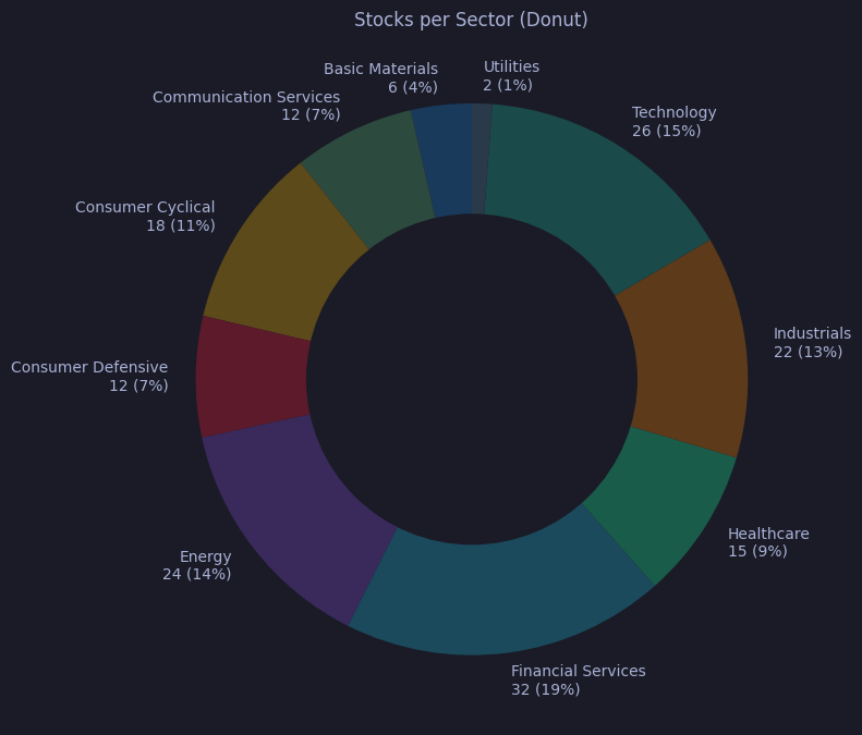
Seaborn — Statistical Plots
Seaborn provides high-level functions for statistical visualization — distribution shapes, group comparisons, correlations, and regression. It handles grouping, faceting, and confidence intervals automatically.
Best for: Exploratory data analysis (EDA) when you need to understand distributions (violin, box, KDE), relationships (regression, pair plots), and group differences (strip, swarm). Accepts Pandas DataFrames directly with column-name-based API.
Box Plot
How to read
- Box = interquartile range (IQR): middle 50% of data (Q1 to Q3)
- Line inside box = median (Q2)
- Whiskers = extend to the farthest point within 1.5×IQR from the box edges
- Circles/diamonds beyond whiskers = outliers (individual data points outside 1.5×IQR)
- Notch (if enabled) = 95% confidence interval around the median; non-overlapping notches between groups suggest significantly different medians
Seaborn | Box plot
Plots composite score distributions for each sector as a box plot, using sns.boxplot() on scores_pd — each box spans the IQR, the centre line marks the median, whiskers extend to 1.5×IQR, and dots beyond whiskers are outlier stocks.
# Quartile summary of composite scores per sector — shows median, IQR, and outliers
fig, ax = plt.subplots(figsize=(10, 5))
sns.boxplot(data=scores_pd, x="sector", y="composite_score", ax=ax)
ax.set_title("Composite Score by Sector")
plt.xticks(rotation=45, ha="right")
plt.tight_layout()
plt.show()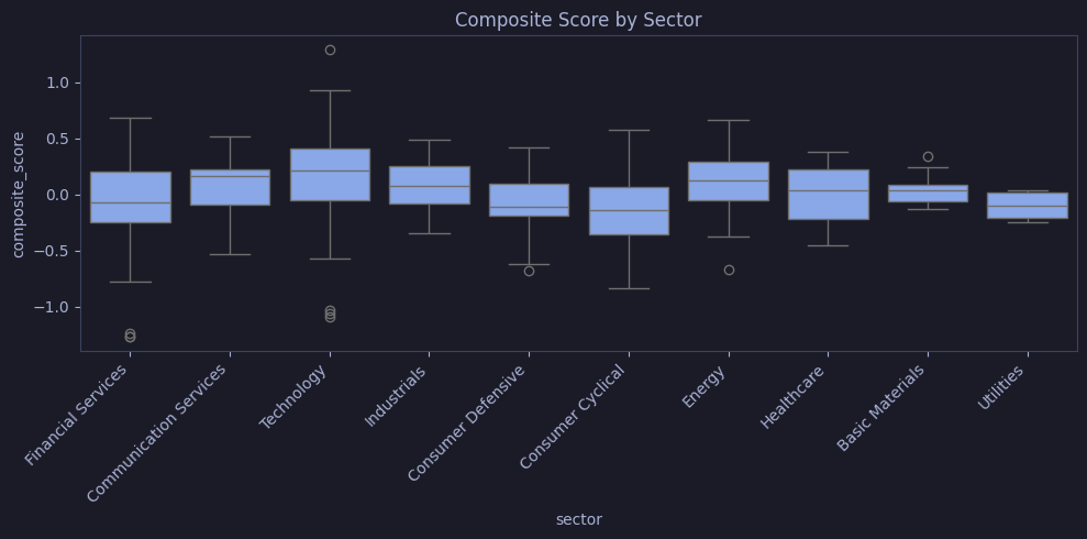
Violin Plot
How to read
- Width = density estimate (wider = more data points at that value)
- Inner box/lines = quartiles (same as box plot: Q1, median, Q3)
- Shape = full distribution — symmetric = normal; multiple bulges = multimodal; long tail = skewed
- Compare width across groups: a wider section means more stocks cluster at that score level
Seaborn | Violin plot
Draws violin plots of composite scores by sector using inner="quart", revealing the full density shape (width = data density) with Q1, median, and Q3 lines drawn inside each violin.
# Full distribution shape per sector — wider = more stocks at that score level
fig, ax = plt.subplots(figsize=(10, 5))
sns.violinplot(data=scores_pd, x="sector", y="composite_score", inner="quart", ax=ax)
ax.set_title("Composite Score (Violin)")
plt.xticks(rotation=45, ha="right")
plt.tight_layout()
plt.show()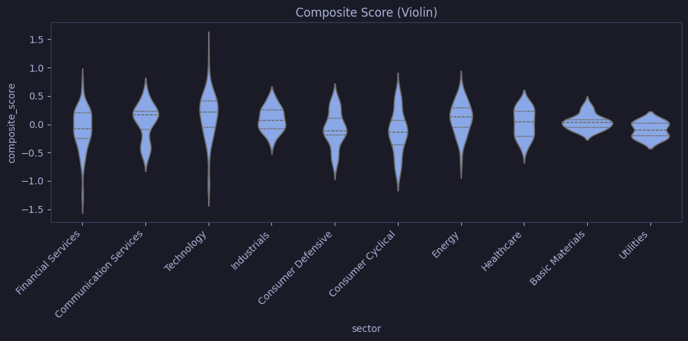
Strip Plot
How to read
- Each dot = one data point (one stock)
- Jitter = small random horizontal offset to prevent dots from stacking on top of each other
- Dense clusters = many values near that level; isolated dots = outliers
- Best for small-to-medium datasets (<500 points per group)
Seaborn | Strip plot
Renders every stock’s composite score as a jittered dot within its sector band using sns.stripplot(), with alpha=0.5 to expose overlapping points and reveal where values cluster most densely.
# Every individual stock plotted as a dot, jittered to avoid overlap
fig, ax = plt.subplots(figsize=(10, 5))
sns.stripplot(data=scores_pd, x="sector", y="composite_score", jitter=True, alpha=0.5, ax=ax)
ax.set_title("Composite Score (Strip)")
plt.xticks(rotation=45, ha="right")
plt.tight_layout()
plt.show()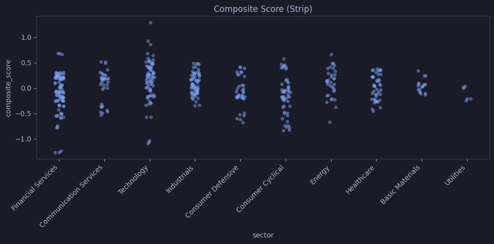
Swarm Plot
How to read
- Like strip plot, but dots are algorithmically spread so no two overlap
- Width of the swarm at a given y-value reflects how many points are near that value (like a violin)
- Gives exact count — every point is visible and countable
- Slow for large datasets (>300 points per group)
Seaborn | Swarm plot
Positions each stock’s composite score as a non-overlapping dot within its sector band using sns.swarmplot() — swarm width at any score level directly reflects how many stocks score there, combining the precision of a strip plot with the density readability of a violin.
# Swarm works best with smaller datasets
fig, ax = plt.subplots(figsize=(10, 5))
sns.swarmplot(data=scores_pd, x="sector", y="composite_score", size=3, ax=ax)
ax.set_title("Composite Score (Swarm)")
plt.xticks(rotation=45, ha="right")
plt.tight_layout()
plt.show()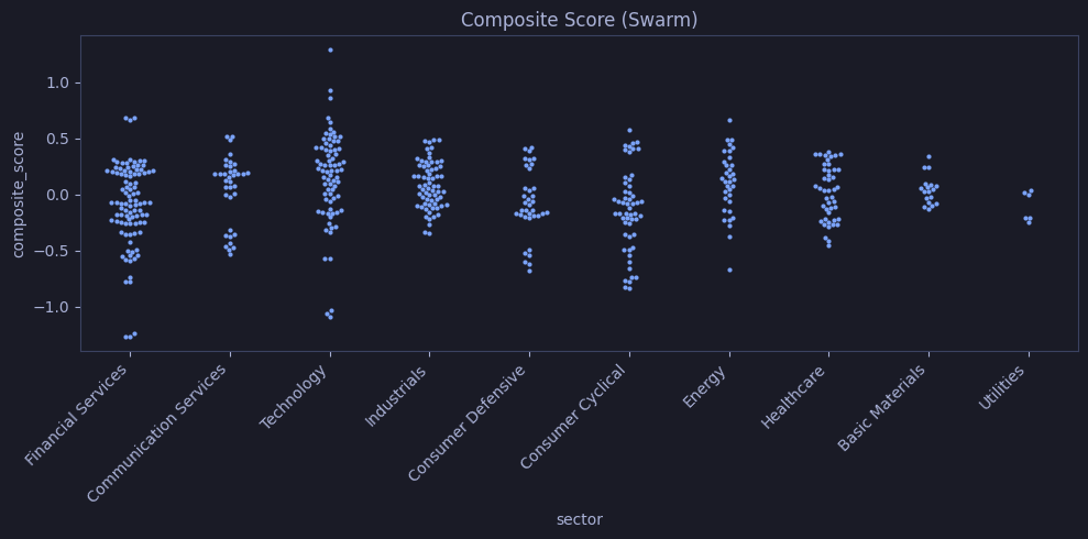
Heatmap
How to read
- Color intensity = magnitude of the value in each cell
- Diverging scale (RdBu): red = strong positive, white = zero, blue = strong negative
- Diagonal (in correlation matrix) = always 1.0 (variable correlated with itself)
- Off-diagonal symmetry = correlation is symmetric: corr(A,B) = corr(B,A)
- Look for dark clusters of red/blue — these indicate groups of highly correlated variables
Seaborn | Heatmap
Computes the pairwise Pearson correlation matrix for all numeric columns in scores_pd and renders it as an annotated heatmap — red cells identify positively correlated score pairs, blue cells identify negatively correlated ones.
# Pairwise correlation between all numeric score columns — red = positive, blue = negative
corr = scores_pd.select_dtypes("number").corr()
fig, ax = plt.subplots(figsize=(12, 10))
sns.heatmap(corr, annot=True, fmt=".2f", cmap="RdBu_r", center=0,
            square=True, linewidths=0.5, ax=ax,
            annot_kws={"size": 7})
ax.set_title("Score Correlation Matrix")
plt.tight_layout()
plt.show()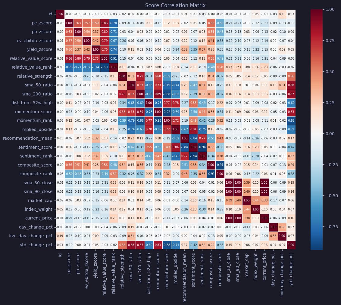
Clustermap
How to read
- Same as heatmap, but rows and columns are reordered by hierarchical clustering
- Dendrograms (tree diagrams on the sides) show which variables are most similar
- Variables that merge early in the tree are more correlated with each other
- Look for diagonal blocks of strong color — these are clusters of related metrics
Seaborn | Clustermap (hierarchical clustering)
Passes the same correlation matrix to sns.clustermap() — rows and columns are reordered by Ward hierarchical clustering, so metrics that correlate strongly appear adjacent, exposing cluster structure that the fixed-order heatmap may hide.
# Clustermap reorders rows/cols by similarity
g = sns.clustermap(corr, annot=True, fmt=".2f", cmap="RdBu_r", center=0,
                   figsize=(12, 10), linewidths=0.5,
                   annot_kws={"size": 7})
g.fig.suptitle("Clustered Correlation Matrix", y=1.02)
plt.show()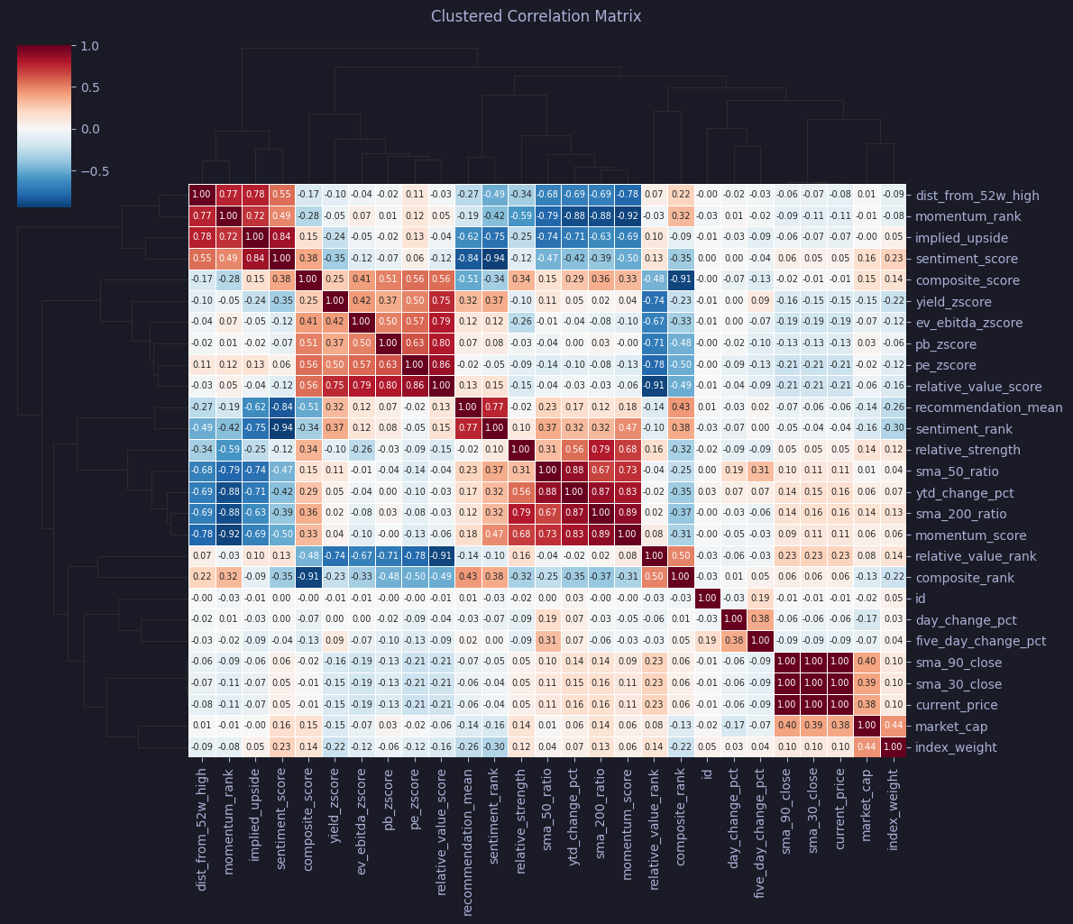
Pair Plot
How to read
- Grid of scatter plots: every pair of numeric columns plotted against each other
- Diagonal = distribution of each variable (KDE or histogram)
- Off-diagonal = scatter of row-variable (y) vs column-variable (x)
- Color = categorical grouping — separated clusters suggest the groups differ on those dimensions
- Quick way to spot correlations, clusters, and outliers across all variable pairs
Seaborn | Pair plot
Generates a sector-colored pair plot for momentum_score, relative_value_score, and composite_score — scatter panels reveal cross-metric relationships while the diagonal KDE panels show each score’s distribution per sector.
# Pair plot for selected numeric columns
cols = ["momentum_score", "relative_value_score", "composite_score", "sector"]
g = sns.pairplot(scores_pd[cols], hue="sector", diag_kind="kde",
                 plot_kws={"alpha": 0.5, "s": 20}, height=2.5)
g.fig.suptitle("Pair Plot: Scores by Sector", y=1.02)
plt.show()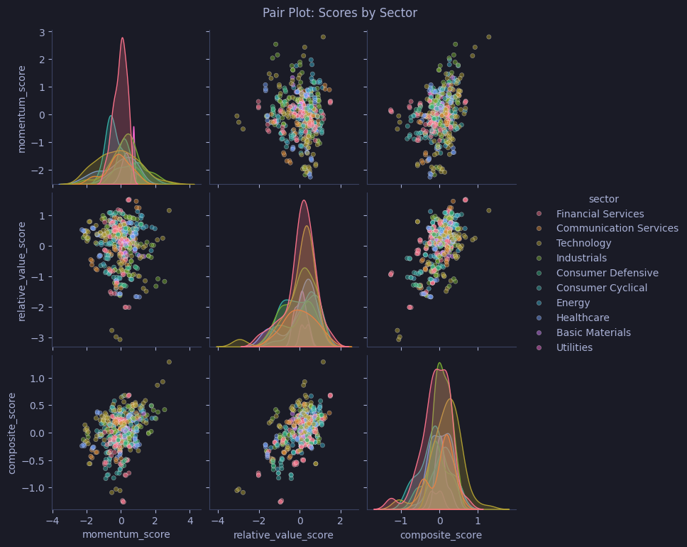
Joint Plot
How to read
- Center = scatter (or hexbin/KDE) of two variables
- Top margin = distribution of the x-variable
- Right margin = distribution of the y-variable
- Hexbin mode: color intensity = count of points in each hex — dark = dense cluster
- Combines relationship analysis with individual distributions in one view
Seaborn | Joint plot
Plots momentum vs. relative value scores as a hexbin joint plot using kind="hex" — hex color intensity shows where most stocks concentrate in score space, while the top and right margins show each variable’s marginal distribution.
# Momentum vs value with marginal hexbin density showing where most stocks concentrate
g = sns.jointplot(data=scores_pd, x="momentum_score", y="relative_value_score",
                  kind="hex", height=7)
g.fig.suptitle("Joint Plot: Momentum vs Value", y=1.02)
plt.show()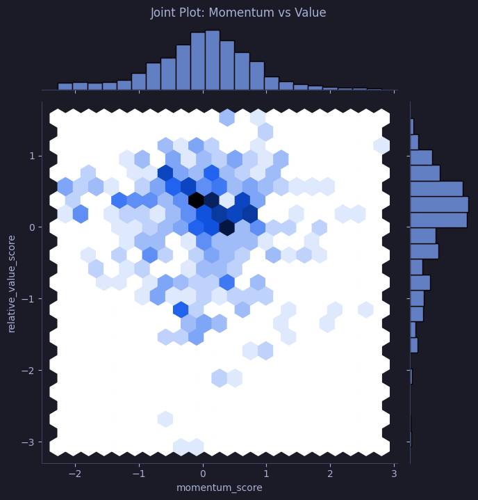
KDE Plot
How to read
- Curve height = estimated probability density (not count)
- Peaks = modes — values where data concentrates
- Width/spread = variance — wider curve = more dispersed data
- Fill = area under curve always sums to 1.0
- Overlaying multiple KDEs reveals which groups overlap or separate in their distributions
Seaborn | KDE plot
Overlays filled KDE curves for ASML, SAP, and SIE close prices — fill=True with alpha=0.3 lets the distributions overlap visibly, showing which stocks share a price range and which are distinct.
# Smooth density curves comparing close price distributions across 3 stocks
fig, ax = plt.subplots(figsize=(10, 5))
for sym in ["ASML.AS", "SAP.DE", "SIE.DE"]:
    data = ohlcv_pd[ohlcv_pd["symbol"] == sym]["close"]
    sns.kdeplot(data, label=sym, ax=ax, fill=True, alpha=0.3)
ax.set_title("KDE: Close Price Distribution")
ax.legend()
plt.tight_layout()
plt.show()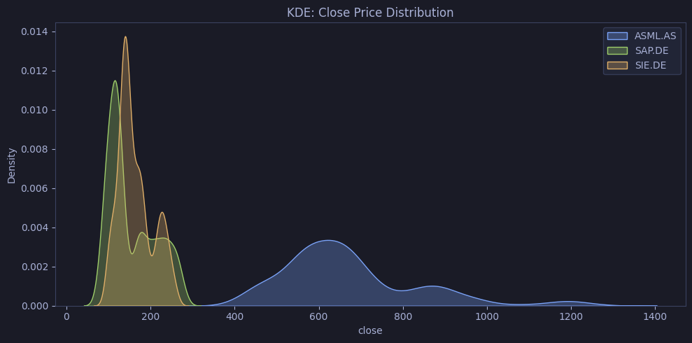
Regression Plot
How to read
- Dots = individual data points
- Line = OLS (ordinary least squares) best-fit line
- Shaded band = 95% confidence interval around the regression line
- Steep slope = strong relationship; flat slope = weak/no relationship
- Wide confidence band = high uncertainty (small sample or high variance)
Seaborn | Regression plot
Fits an OLS regression line between momentum_score and relative_value_score across all stocks in scores_pd, rendering scatter points at alpha=0.4 and a red best-fit line with shaded 95% confidence band.
# Linear regression fit between momentum and value — shows direction and strength of relationship
fig, ax = plt.subplots(figsize=(8, 6))
sns.regplot(data=scores_pd, x="momentum_score", y="relative_value_score",
            scatter_kws={"alpha": 0.4}, line_kws={"color": "#f7768e"}, ax=ax)
ax.set_title("Regression: Momentum vs Value")
plt.tight_layout()
plt.show()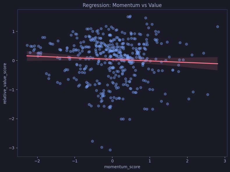
Residual Plot
How to read
- Each dot = residual (actual value minus predicted value from linear fit)
- Ideal pattern: random scatter around zero — no visible structure
- Funnel shape = heteroscedasticity (variance changes with x)
- Curved pattern = the relationship is non-linear — linear model is a poor fit
- Clusters = possible subgroups that the model treats as one
Seaborn | Residual plot
Plots the residuals from regressing relative_value_score on momentum_score — a random horizontal scatter around zero confirms the linear model is adequate; curves or fans indicate nonlinearity or heteroscedasticity.
# Residuals from the linear fit — random scatter = good fit, patterns = nonlinearity
fig, ax = plt.subplots(figsize=(8, 5))
sns.residplot(data=scores_pd, x="momentum_score", y="relative_value_score",
              scatter_kws={"alpha": 0.4}, ax=ax)
ax.set_title("Residuals: Momentum vs Value")
plt.tight_layout()
plt.show()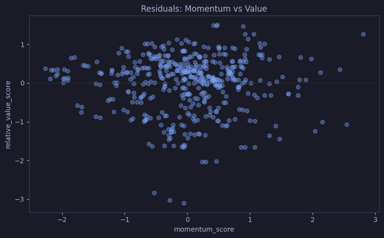
Count Plot
How to read
- Bar length = number of observations in each category
- Essentially a histogram for categorical data
- Ordered by count to quickly identify the most/least populated categories
Seaborn | Count plot
Draws a horizontal count bar for each sector in dim_pd, ordered from most to fewest constituent companies — bar length directly reads as the number of index members per sector.
# Count of stocks in each sector — bar length = number of constituent companies
fig, ax = plt.subplots(figsize=(10, 5))
sns.countplot(data=dim_pd, y="sector", order=dim_pd["sector"].value_counts().index, ax=ax)
ax.set_title("Number of Stocks per Sector")
plt.tight_layout()
plt.show()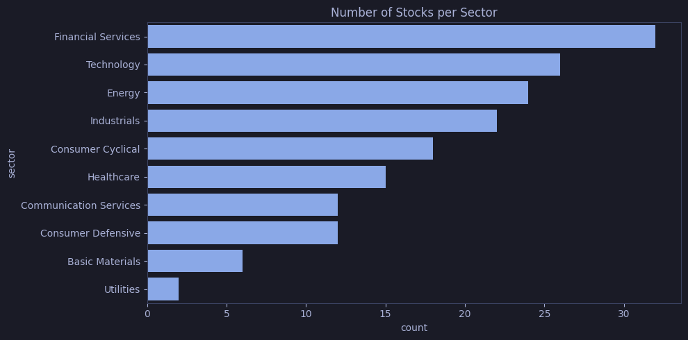
ECDF
How to read
- X-axis = variable values; Y-axis = cumulative proportion (0 to 1)
- Read as: “what fraction of data falls below this value?”
- Steep section = many values concentrated in a narrow range
- Flat section = sparse region with few data points
- Curves shifted right = higher values overall; compare vertical gaps between groups at any x to see which group has more data below that threshold
Seaborn | ECDF (Empirical CDF)
Plots one ECDF curve per sector using scores_pd, so each curve answers “what fraction of stocks in this sector score below X?” — sectors with right-shifted curves have systematically higher composite scores.
# Cumulative distribution per sector — read off what % of stocks score below a threshold
fig, ax = plt.subplots(figsize=(10, 4))
sns.ecdfplot(data=scores_pd, x="composite_score", hue="sector", ax=ax)
ax.set_title("ECDF of Composite Score by Sector")
plt.tight_layout()
plt.show()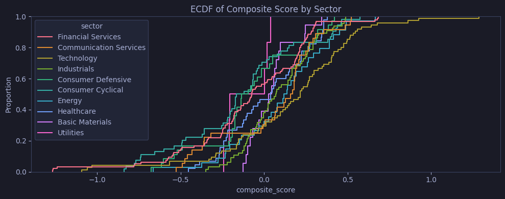
Rug Plot
How to read
- Short ticks on the axis = exact position of each data point
- Combined with KDE, it grounds the smooth curve in actual observations
- Dense ticks = cluster of values; gaps = sparse regions
- Useful for small-to-medium datasets; too many ticks become a solid bar
Seaborn | Rug plot
Draws a filled KDE curve for composite_score across all stocks in scores_pd, then adds sns.rugplot() tick marks on the x-axis — each tick is one stock, grounding the smooth density in the actual data points.
# KDE density with rug ticks showing exact score positions of each stock
fig, ax = plt.subplots(figsize=(10, 3))
sns.kdeplot(data=scores_pd, x="composite_score", fill=True, alpha=0.3, ax=ax)
sns.rugplot(data=scores_pd, x="composite_score", height=0.1, ax=ax)
ax.set_title("KDE + Rug: Composite Score")
plt.tight_layout()
plt.show()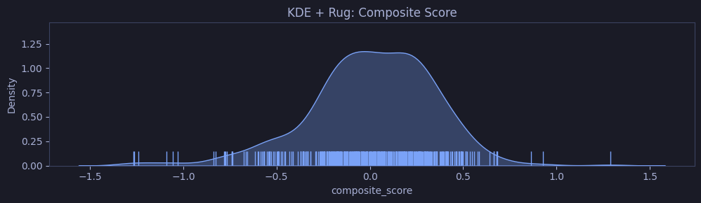
Matplotlib — Advanced
Matplotlib is the low-level engine behind Pandas and Seaborn plots. Use it directly when you need full control: custom layouts, mixed chart types in subplots, annotations, polar coordinates, or any visualization not covered by higher-level APIs.
Best for: Publication-quality figures, custom dashboards, unconventional chart types (radar, stem), and any scenario where you need pixel-level control over every element.
Subplots Grid
Matplotlib | Subplots grid
Creates a 2×2 subplot grid with plt.subplots(2, 2) — top row: close price line and volume line; bottom row: close price histogram and open-vs-close scatter — all fed from the 365-day asml subset.
# 2x2 dashboard: close price, volume, distribution, and open-vs-close scatter for ASML
fig, axes = plt.subplots(2, 2, figsize=(12, 8))

asml.plot(x="date", y="close", ax=axes[0, 0], title="Close", legend=False)
asml.plot(x="date", y="volume", ax=axes[0, 1], title="Volume", legend=False)
axes[1, 0].hist(asml["close"], bins=30)
axes[1, 0].set_title("Close Distribution")
axes[1, 1].scatter(asml["open"], asml["close"], alpha=0.5, s=10)
axes[1, 1].set_title("Open vs Close")

fig.suptitle("ASML Dashboard", fontsize=16)
plt.tight_layout()
plt.show()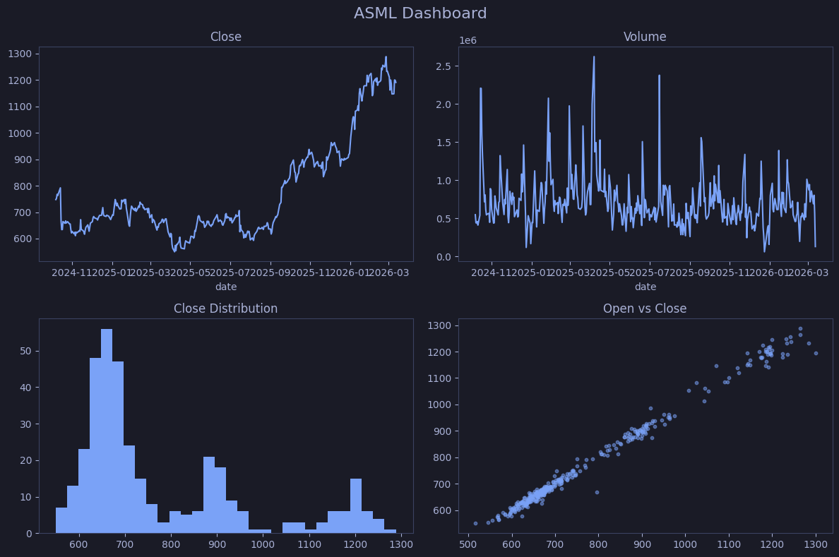
Step Plot
How to read
- Value stays flat between changes, then jumps vertically
- Emphasizes that the value is constant between updates (unlike a line chart which implies interpolation)
- Best for discrete-step data: interest rates, pricing tiers, digital signals
Matplotlib | Step plot
Renders ASML’s 365-day close price as a step function using where="mid" — each horizontal segment holds the price constant between observations, making it explicit that no value is interpolated between trading days.
# Step plot — shows price as flat segments between changes (useful for discrete-step data)
fig, ax = plt.subplots(figsize=(10, 4))
ax.step(asml["date"], asml["close"], where="mid", color="#7aa2f7")
ax.set_title("ASML Close (Step)")
plt.tight_layout()
plt.show()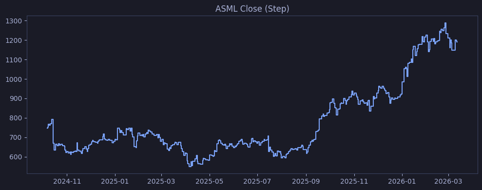
Stem Plot
How to read
- Vertical line from baseline (zero) to the value — length = magnitude
- Dot at tip = the actual value
- Lines above zero = positive; below = negative
- Best for discrete events: daily returns, impulse responses, sparse signals
Matplotlib | Stem plot
Computes ASML daily percentage returns with pct_change() * 100, then renders each as a vertical stem from zero — stem length encodes daily return magnitude, with stems above/below zero distinguishing gains from losses.
# Stem plot of daily returns — each vertical line = one day's % change from previous close
returns = asml["close"].pct_change().dropna() * 100
fig, ax = plt.subplots(figsize=(10, 4))
ax.stem(asml["date"].iloc[1:], returns, linefmt="#7aa2f7", markerfmt="o", basefmt="#3b4261")
ax.set_title("ASML Daily Returns (%)")
plt.tight_layout()
plt.show()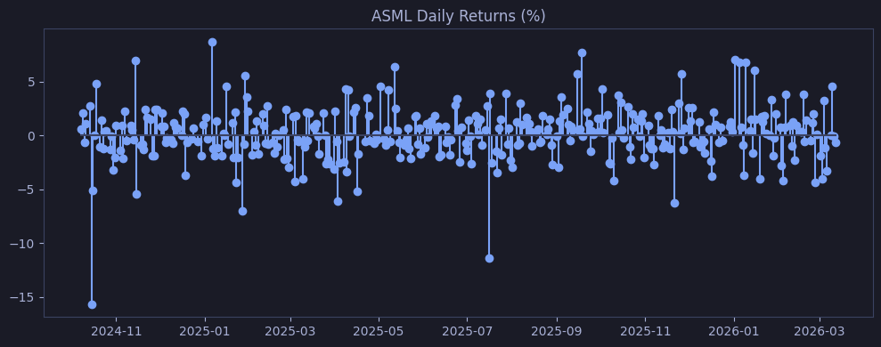
Stackplot
Matplotlib | Stackplot
Pivots ASML, SAP, and SIE daily volume into wide format, drops NaN rows, then calls ax.stackplot() with unpacked columns — provides finer control than Pandas .plot.area() for custom colors and per-layer alpha.
# Native matplotlib stacked area — same as Pandas .plot.area but with more control
vol_pivot = top5[top5["symbol"].isin(top5_syms[:3])].pivot_table(
    index="date", columns="symbol", values="volume", aggfunc="sum").dropna()
fig, ax = plt.subplots(figsize=(10, 5))
ax.stackplot(vol_pivot.index, *[vol_pivot[c] for c in vol_pivot.columns],
             labels=vol_pivot.columns, alpha=0.7)
ax.set_title("Stacked Volume")
ax.legend(loc="upper left")
plt.tight_layout()
plt.show()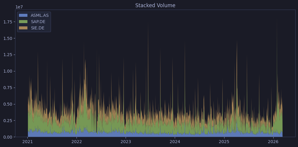
Polar / Radar Chart
How to read
- Each spoke = one dimension/metric (e.g., momentum, value, sentiment, composite)
- Distance from center = score magnitude on that dimension
- Shape reveals the profile: balanced (regular polygon) vs specialized (elongated toward one spoke)
- Useful for comparing multi-dimensional profiles of a single entity
Matplotlib | Polar / radar chart
Constructs a polar radar chart for ASML’s four scores (momentum, relative value, sentiment, composite) — the polygon is closed by appending the first value, and the filled area shows how ASML’s profile balances across the four dimensions.
# Radar chart for one stock's scores
cols = ["momentum_score", "relative_value_score", "sentiment_score", "composite_score"]
vals = scores_pd[scores_pd["symbol"] == "ASML.AS"][cols].iloc[0].tolist()
vals += [vals[0]]  # close the polygon

angles = np.linspace(0, 2 * np.pi, len(cols), endpoint=False).tolist()
angles += [angles[0]]

fig, ax = plt.subplots(figsize=(6, 6), subplot_kw=dict(polar=True))
ax.plot(angles, vals, color="#7aa2f7", linewidth=2)
ax.fill(angles, vals, alpha=0.2, color="#7aa2f7")
ax.set_xticks(angles[:-1])
ax.set_xticklabels(cols, size=9)
ax.set_title("ASML Score Radar")
plt.tight_layout()
plt.show()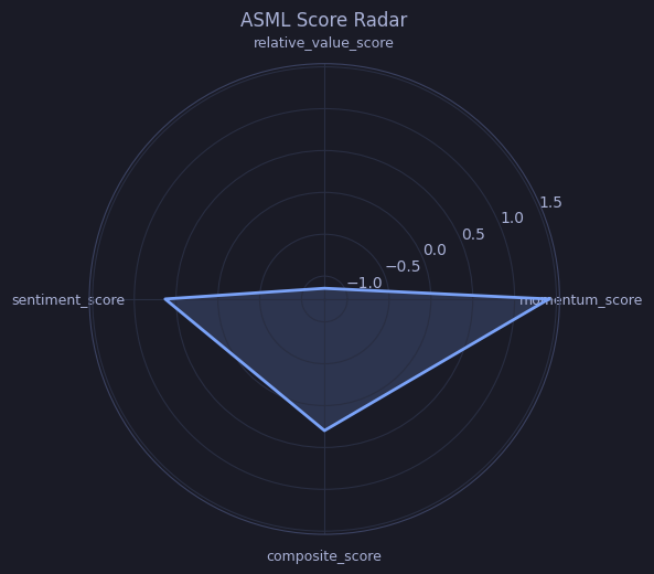
Error Bar Plot
How to read
- Dot = point estimate (mean)
- Bars = uncertainty range (here: ±1 standard deviation)
- Short bars = low dispersion (consistent values); long bars = high dispersion
- Non-overlapping error bars suggest the groups differ meaningfully
Matplotlib | Error bar plot
Groups scores_pd by sector, computes mean and standard deviation of composite_score, then plots mean as a dot with ±1 std dev bars — sectors sorted ascending so the lowest-scoring sectors appear at the bottom.
# Mean composite score per sector with std dev error bars — wider bars = more dispersion
stats = scores_pd.groupby("sector")["composite_score"].agg(["mean", "std"]).sort_values("mean")
fig, ax = plt.subplots(figsize=(10, 5))
ax.errorbar(stats.index, stats["mean"], yerr=stats["std"], fmt="o",
            capsize=5, color="#7aa2f7", ecolor="#f7768e")
ax.set_title("Composite Score: Mean ± Std")
plt.xticks(rotation=45, ha="right")
plt.tight_layout()
plt.show()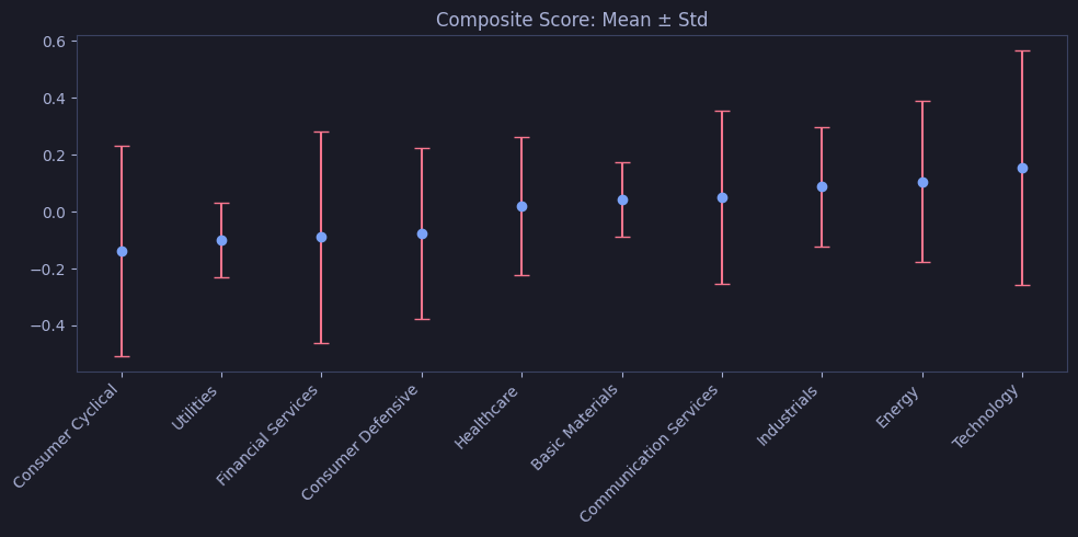
Annotations and Text
Matplotlib | Annotations & text
Finds the max and min close price indices with idxmax()/idxmin(), adds ax.annotate() arrows pointing to each, then draws a dashed axhline at the mean price — demonstrating Matplotlib’s annotation layer on top of a line chart.
# Close price with annotated max/min points and mean reference line
fig, ax = plt.subplots(figsize=(10, 4))
ax.plot(asml["date"], asml["close"], color="#7aa2f7")

# Mark max and min
max_idx = int(asml["close"].idxmax())
min_idx = int(asml["close"].idxmin())
for idx, label, color, offset in [
    (max_idx, "Max", "#9ece6a", (20, 15)),
    (min_idx, "Min", "#f7768e", (-60, -40)),
]:
    x = asml["date"].loc[idx]  # type: ignore[arg-type]
    y: float = asml["close"].loc[idx].item()  # type: ignore[union-attr]
    ax.annotate(f"{label}: {y:.0f}", xy=(x, y),
                xytext=offset, textcoords="offset points",
                arrowprops=dict(arrowstyle="->", color=color), color=color)

ax.axhline(asml["close"].mean(), linestyle="--", color="#e0af68", alpha=0.7, label="Mean")
ax.legend()
ax.set_title("ASML with Annotations")
plt.tight_layout()
plt.show()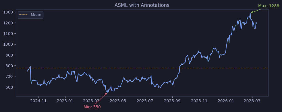
Polars to Pandas for Plotting
Polars has no built-in .plot() method. Matplotlib and Seaborn both operate on NumPy arrays and Pandas DataFrames — they cannot consume a Polars DataFrame directly. The standard workflow is .to_pandas() for conversion.
Polars + Plotly: no conversion needed (Plotly 6+)
Plotly Express accepts Polars DataFrames directly since Plotly 6.0 (released 2025). Column names are resolved via the
__dataframe__protocol. This meanspx.line(df_polars, x="date", y="close")works without.to_pandas(). See the## Plotly with Polars DataFramessection below for examples.Matplotlib and Seaborn do not support the
__dataframe__protocol — always convert with.to_pandas()before using these libraries.
.to_pandas()memory cost on large Polars frames
.to_pandas()copies the entire DataFrame into memory as a new Pandas object. For a 5M-row frame, this can double peak memory usage. If you only need to plot a subset, filter and slice in Polars before converting:df.filter(...).head(10_000).to_pandas(). ForLazyFrame, call.collect().to_pandas()—.collect()triggers full evaluation first.
Reduce the frame before converting it for plotting
Keep filtering, column selection, and downsampling in Polars, then convert only the rows and columns the chart actually needs. That keeps plotting ergonomic without paying a full-frame Pandas copy cost.
Conversion Example
Polars | Convert to Pandas for plotting
Filters ohlcv_pl to ASML’s last 90 trading days in Polars, chains .to_pandas() to produce a Pandas DataFrame, then calls .plot() on the result — demonstrating the complete Polars → Pandas → Matplotlib pipeline in three chained calls.
asml_pl = ohlcv_pl.filter(pl.col("symbol") == "ASML.AS").sort("date").tail(90)
asml_pl.to_pandas().plot(x="date", y="close", title="ASML (Polars → Pandas plot)",
                         figsize=(10, 4), legend=False)
plt.tight_layout()
plt.show()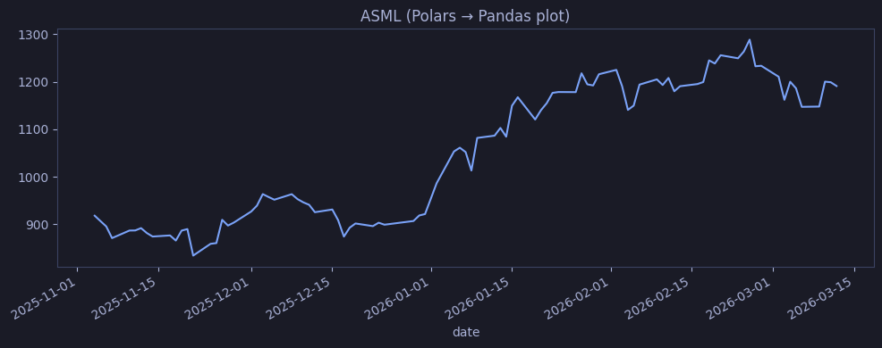
Matplotlib / Seaborn Summary
When to use Matplotlib/Seaborn vs Plotly?
- Matplotlib/Pandas
.plot()— publication-quality static figures (PNG/SVG/PDF), fine-grained layout control, integration with reporting pipelines that don’t render HTML. Required for Seaborn’s statistical plots (violin, pair, joint, clustermap).- Seaborn — EDA shortcut for statistical visualization: distribution comparison, regression overlays, clustered correlation matrices. Accepts DataFrames directly with column-name API; handles grouping and confidence intervals automatically.
- Plotly — interactive exploration in notebooks and dashboards (hover, zoom, dropdown filters). Best for stakeholder-facing output or when you need to explore specific data points. Polars DataFrames accepted directly since Plotly 6.
Default workflow: use Seaborn/Matplotlib for analysis you’ll export to a report; use Plotly for analysis you’ll share as a notebook or web dashboard.
| Chart | Matplotlib / Pandas | Seaborn |
|---|---|---|
| Line | ax.plot() / df.plot() | sns.lineplot() |
| Bar | df.plot.bar() / .barh() | sns.barplot() / sns.countplot() |
| Histogram | df.plot.hist() | sns.histplot() |
| KDE | df.plot.kde() | sns.kdeplot() |
| Scatter | df.plot.scatter() | sns.scatterplot() / sns.regplot() |
| Area | df.plot.area() / ax.stackplot() | — |
| Pie | df.plot.pie() | — |
| Box | — | sns.boxplot() |
| Violin | — | sns.violinplot() |
| Strip | — | sns.stripplot() |
| Swarm | — | sns.swarmplot() |
| Heatmap | ax.imshow() | sns.heatmap() / sns.clustermap() |
| Pair | — | sns.pairplot() |
| Joint | — | sns.jointplot() |
| ECDF | — | sns.ecdfplot() |
| Regression | — | sns.regplot() / sns.residplot() |
| Hexbin | ax.hexbin() | — |
| Step | ax.step() | — |
| Stem | ax.stem() | — |
| Polar/Radar | subplot_kw=dict(polar=True) | — |
| Error bars | ax.errorbar() | — |
| Fill between | ax.fill_between() | — |
Bokeh — Interactive Charts
Bokeh is the low-level interactive counterpart to the static Matplotlib/Seaborn examples above: browser-native rendering, linked brushing, widgets, and dashboard composition without switching libraries. The cells below are extracted from the source Bokeh notebook and embedded as standalone local HTML documents so the plots render correctly inside Obsidian. The static Matplotlib and Seaborn outputs are also stored as local PNG files extracted directly from the base visualization notebook.
Bokeh vs Plotly
Use Bokeh when you want notebook-native widgets,
CustomJScallbacks, linked brushing, andDataTableintegration. Use Plotly when you want a higher-level API, quicker chart authoring, and export-friendly interactive figures with polished defaults.
Setup and Theme Configuration
Run the setup cells once before the Bokeh examples. They import the Bokeh stack, enable output_notebook(), apply the Tokyo Night theme, and define the helper that keeps figures, widgets, axes, and tool overlays visually consistent.
# Standard Library
from pathlib import Path
import warnings
import datetime as _dt
import math
import json as _json
import tempfile

# Data Science
import pandas as pd
import numpy as np
from scipy.stats import gaussian_kde

# Bokeh - Interactive Plotting
from bokeh.io import output_notebook, show, save, curdoc
from bokeh.plotting import figure
from bokeh.models import (
    ColumnDataSource, HoverTool, CrosshairTool, TapTool,
    ColorBar, LinearColorMapper, CategoricalColorMapper, BasicTicker,
    Span, Label, Arrow, NormalHead, Band, BoxAnnotation, Whisker,
    DatetimeTickFormatter, NumeralTickFormatter,
    Range1d, FactorRange,
    Select, RangeSlider, Slider, Tabs, TabPanel, CustomJS,
    DataTable, TableColumn, StringFormatter, NumberFormatter,
    LinearAxis, InlineStyleSheet
)
from bokeh.layouts import gridplot, column, row
from bokeh.palettes import Category10, Spectral11, Viridis256, Turbo256
from bokeh.transform import linear_cmap, factor_cmap, cumsum, dodge
from bokeh.themes import Theme
#### Setup: display formatters and Bokeh theme
warnings.filterwarnings("ignore")
html_formatter = get_ipython().display_formatter.formatters["text/html"] # type: ignore
html_formatter.for_type(pd.DataFrame, lambda df: df.to_html())
html_formatter.for_type(pd.Series, lambda s: s.to_frame().to_html())
pd.set_option("display.max_rows", 100)
DATA = Path("../data")
TMP = Path(tempfile.mkdtemp())
# Bokeh - interactive browser visualization
output_notebook()
# Tokyo Night theme for Bokeh with transparent plot/background fills
TOKYO_NIGHT = Theme(json={
"attrs": {
"Figure": {
"background_fill_color": "#1a1b26",
"background_fill_alpha": 0.0,
"border_fill_color": "#1a1b26",
"border_fill_alpha": 0.0,
"outline_line_color": "#3b4261",
},
"Axis": {
"axis_line_color": "#3b4261",
"axis_label_text_color": "#a9b1d6",
"major_label_text_color": "#a9b1d6",
"major_tick_line_color": "#3b4261",
"minor_tick_line_color": "#292e42",
},
"Grid": {
"grid_line_color": "#292e42",
"grid_line_alpha": 0.6,
},
"Legend": {
"background_fill_color": "#24283b",
"background_fill_alpha": 0.85,
"border_line_color": "#3b4261",
"label_text_color": "#a9b1d6",
},
"Title": {
"text_color": "#a9b1d6",
"text_font_size": "16pt",
},
"ColorBar": {
"background_fill_color": "#1a1b26",
"background_fill_alpha": 0.0,
"label_standoff": 8,
"major_label_text_color": "#a9b1d6",
"title_text_color": "#a9b1d6",
},
}
})
curdoc().theme = TOKYO_NIGHT
# Dark stylesheet for DataTable widgets
dark_css = InlineStyleSheet(css="""
.slick-header-column { background: #24283b !important; color: #a9b1d6 !important; }
.slick-row { background: #1a1b26 !important; color: #a9b1d6 !important; }
.slick-row.odd { background: #24283b !important; }
.slick-cell { border-color: #3b4261 !important; }
.slick-header-column { border-color: #3b4261 !important; }
""")
# Reusable color constants
TN = {
"blue": "#7aa2f7", "green": "#9ece6a", "yellow": "#e0af68", "red": "#f7768e",
"purple": "#bb9af7", "cyan": "#7dcfff", "teal": "#73daca", "orange": "#ff9e64",
"bg": "#1a1b26", "surface": "#24283b", "border": "#3b4261",
"text": "#a9b1d6", "grid": "#292e42",
}
TN_PALETTE = [TN["blue"], TN["green"], TN["yellow"], TN["red"],
TN["purple"], TN["cyan"], TN["teal"], TN["orange"]]
# Bokeh-only helper: enforce dark styling for figures, layouts, widgets, and tool overlays
_bokeh_show = show
LINE_WINDOW_DAYS = 60
def _iter_model_collection(value):
if value is None or isinstance(value, (str, bytes, dict, int, float, bool)):
return []
if isinstance(value, tuple):
return list(value)
if isinstance(value, list):
return value
try:
return list(value)
except TypeError:
return []
def _walk_models(obj):
seen = set()
def walk(item):
if item is None:
return
item_id = id(item)
if item_id in seen:
return
seen.add(item_id)
yield item
child = getattr(item, "child", None)
if child is not None:
yield from walk(child)
for attr in ("children", "tabs", "left", "right", "above", "below", "center"):
for nested in _iter_model_collection(getattr(item, attr, None)):
if isinstance(nested, tuple):
nested = nested[0]
yield from walk(nested)
toolbar = getattr(item, "toolbar", None)
if toolbar is not None:
yield from walk(toolbar)
for tool in _iter_model_collection(getattr(item, "tools", None)):
yield from walk(tool)
overlay = getattr(item, "overlay", None)
if overlay is not None:
yield from walk(overlay)
yield from walk(obj)
def apply_bokeh_dark_theme(obj):
for item in _walk_models(obj):
if hasattr(item, "background_fill_color"):
item.background_fill_color = TN["bg"]
if hasattr(item, "border_fill_color"):
item.border_fill_color = TN["bg"]
if hasattr(item, "outline_line_color"):
item.outline_line_color = TN["border"]
item_name = item.__class__.__name__
if item_name in {"figure", "Figure", "Plot", "ColorBar"}:
if hasattr(item, "background_fill_alpha"):
item.background_fill_alpha = 0.0
if hasattr(item, "border_fill_alpha"):
item.border_fill_alpha = 0.0
title = getattr(item, "title", None)
if title is not None and hasattr(title, "text_color"):
title.text_color = TN["text"]
for axis_list_name in ("xaxis", "yaxis"):
for axis in _iter_model_collection(getattr(item, axis_list_name, None)):
axis.axis_line_color = TN["border"]
axis.axis_label_text_color = TN["text"]
axis.major_label_text_color = TN["text"]
axis.major_tick_line_color = TN["border"]
axis.minor_tick_line_color = TN["grid"]
for grid in _iter_model_collection(getattr(item, "grid", None)):
grid.grid_line_color = TN["grid"]
grid.grid_line_alpha = 0.6
for legend in _iter_model_collection(getattr(item, "legend", None)):
legend.background_fill_color = TN["surface"]
legend.background_fill_alpha = 0.85
legend.border_line_color = TN["border"]
legend.label_text_color = TN["text"]
side_items = _iter_model_collection(getattr(item, "left", None)) + _iter_model_collection(getattr(item, "right", None))
for side_item in side_items:
if hasattr(side_item, "major_label_text_color"):
side_item.major_label_text_color = TN["text"]
if hasattr(side_item, "title_text_color"):
side_item.title_text_color = TN["text"]
if side_item.__class__.__name__ == "ColorBar":
side_item.background_fill_alpha = 0.0
elif hasattr(side_item, "background_fill_color"):
side_item.background_fill_color = TN["bg"]
if item_name == "DataTable":
stylesheets = list(getattr(item, "stylesheets", []) or [])
if dark_css not in stylesheets:
item.stylesheets = stylesheets + [dark_css]
if item_name == "CrosshairTool" and hasattr(item, "line_color"):
item.line_color = TN["cyan"]
if item_name == "BoxAnnotation":
if getattr(item, "fill_color", None) in (None, "lightgrey", "white"):
item.fill_color = TN["surface"]
if getattr(item, "line_color", None) in (None, "black"):
item.line_color = TN["text"]
item.fill_alpha = 0.18
item.line_alpha = 0.6
def _figure_has_datetime_axis(fig):
for axis in _iter_model_collection(getattr(fig, "xaxis", None)):
if axis.__class__.__name__ == "DatetimeAxis":
return True
return False
def _collect_numeric_renderer_fields(fig):
sources = {}
has_line_renderer = False
for renderer in _iter_model_collection(getattr(fig, "renderers", None)):
glyph = getattr(renderer, "glyph", None)
source = getattr(renderer, "data_source", None)
if glyph is None or source is None or not hasattr(source, "data"):
continue
glyph_name = glyph.__class__.__name__
if glyph_name in {"Line", "Step"}:
has_line_renderer = True
x_field = None
for attr in ("x", "xs"):
value = getattr(glyph, attr, None)
if isinstance(value, str) and value in source.data:
x_field = value
break
if hasattr(value, "field") and value.field in source.data:
x_field = value.field
break
if x_field is None:
for fallback in ("date", "x"):
if fallback in source.data:
x_field = fallback
break
if x_field is None:
continue
try:
x_values = pd.to_datetime(source.data[x_field])
if len(x_values) == 0 or pd.isna(x_values).all():
continue
except Exception:
continue
y_range_name = getattr(renderer, "y_range_name", None) or "default"
y_fields = set()
for attr in ("y", "y0", "y1", "y2", "top", "bottom"):
value = getattr(glyph, attr, None)
field = None
if isinstance(value, str) and value in source.data:
field = value
elif hasattr(value, "field") and value.field in source.data:
field = value.field
if field is None:
continue
try:
arr = np.asarray(source.data[field])
if np.issubdtype(arr.dtype, np.number):
y_fields.add(field)
except Exception:
pass
if not y_fields:
continue
sid = id(source)
if sid not in sources:
sources[sid] = {
"source": source,
"x_field": x_field,
"y_by_range": {}
}
sources[sid]["y_by_range"].setdefault(y_range_name, set()).update(y_fields)
return has_line_renderer, list(sources.values())
def configure_datetime_line_window(obj):
for fig in _walk_models(obj):
if fig.__class__.__name__ not in {"figure", "Figure"}:
continue
if not _figure_has_datetime_axis(fig):
continue
if fig.__class__.__name__ == "DataTable":
continue
has_line_renderer, source_maps = _collect_numeric_renderer_fields(fig)
if not has_line_renderer or not source_maps:
continue
all_dates = []
for info in source_maps:
try:
dates = pd.to_datetime(info["source"].data[info["x_field"]])
all_dates.append(pd.Series(dates).dropna())
except Exception:
pass
if not all_dates:
continue
combined_dates = pd.concat(all_dates, ignore_index=True)
if combined_dates.empty:
continue
min_d = combined_dates.min()
max_d = combined_dates.max()
view_start = max(min_d, max_d - pd.Timedelta(days=LINE_WINDOW_DAYS))
fig.x_range = Range1d(start=view_start, end=max_d, bounds=(min_d, max_d))
y_sources = {}
for info in source_maps:
source = info["source"]
x_field = info["x_field"]
dates = pd.to_datetime(source.data[x_field])
mask = (dates >= view_start) & (dates <= max_d)
for range_name, y_fields in info["y_by_range"].items():
y_sources.setdefault(range_name, [])
y_sources[range_name].append((source, x_field, sorted(y_fields), mask))
for range_name, entries in y_sources.items():
y_min = float("inf")
y_max = float("-inf")
for source, _, y_fields, mask in entries:
for field in y_fields:
vals = np.asarray(source.data[field], dtype=float)[mask]
vals = vals[np.isfinite(vals)]
if len(vals):
y_min = min(y_min, float(vals.min()))
y_max = max(y_max, float(vals.max()))
if y_min == float("inf"):
continue
pad = (y_max - y_min) * 0.05 or 1.0
if range_name == "default":
fig.y_range = Range1d(start=y_min - pad, end=y_max + pad)
elif range_name in getattr(fig, "extra_y_ranges", {}):
fig.extra_y_ranges[range_name].start = y_min - pad
fig.extra_y_ranges[range_name].end = y_max + pad
cb_args = {"primary_y": fig.y_range}
js_blocks = []
source_index = 0
extra_ranges = getattr(fig, "extra_y_ranges", {}) or {}
for range_name, entries in y_sources.items():
target_name = "primary_y" if range_name == "default" else f"y_{range_name}"
if range_name != "default":
target = extra_ranges.get(range_name)
if target is None:
continue
cb_args[target_name] = target
js_blocks.append(f"let mn_{target_name}=Infinity, mx_{target_name}=-Infinity;")
for source, x_field, y_fields, _ in entries:
sname = f"s{source_index}"
source_index += 1
cb_args[sname] = source
js_blocks.append(
f"{{ const d={sname}.data, x=d['{x_field}'], ys={_json.dumps(y_fields)};"
f" for(let i=0;i<x.length;i++){{ if(x[i]>=lo&&x[i]<=hi){{"
f" for(const c of ys){{ const v=d[c][i];"
f" if(Number.isFinite(v)){{ if(v<mn_{target_name}) mn_{target_name}=v; if(v>mx_{target_name}) mx_{target_name}=v; }} }} }} }} }}"
)
js_blocks.append(
f"if(mn_{target_name}<Infinity){{ const pad=(mx_{target_name}-mn_{target_name})*0.05||1;"
f" {target_name}.start=mn_{target_name}-pad; {target_name}.end=mx_{target_name}+pad; }}"
)
if js_blocks:
callback = CustomJS(
args=cb_args,
code="const lo=cb_obj.start, hi=cb_obj.end;\n" + "\n".join(js_blocks)
)
fig.x_range.js_on_change("start", callback)
fig.x_range.js_on_change("end", callback)
def show_dark(obj, **kwargs):
apply_bokeh_dark_theme(obj)
configure_datetime_line_window(obj)
return _bokeh_show(obj, **kwargs)
show = show_darkBokeh output is embedded as standalone HTML
Quartz does not execute the notebook’s inline Bokeh cell scripts from markdown, so each output below is exported as a standalone HTML file under
/static/bokeh/df_py_08_XX.htmland embedded with aniframe.
Bokeh Data Preparation
These cells reload the financial datasets used by the notebook and build the reusable ASML, top-5, and sector subsets consumed throughout the examples below.
Pandas | read_parquet (load datasets)
# Load OHLCV, scores, and index dimension tables
ohlcv = pd.read_parquet(DATA / "eurostoxx50_ohlcv.parquet")
ohlcv["date"] = pd.to_datetime(ohlcv["date"])
scores = pd.read_parquet(DATA / "scores_daily.parquet")
dim = pd.read_parquet(DATA / "index_dim.parquet")

print(f"EU OHLCV: {ohlcv.shape}")
print(f"Scores: {scores.shape},  Dim: {dim.shape}")
EU OHLCV: (66355, 12)
Scores: (466, 36), Dim: (169, 26)Pandas | build reusable subsets
# Subsets used across the Bokeh examples
asml = ohlcv[ohlcv["symbol"] == "ASML.AS"].sort_values("date").tail(365).copy().reset_index(drop=True)
sap = ohlcv[ohlcv["symbol"] == "SAP.DE"].sort_values("date").tail(365).copy().reset_index(drop=True)
top5_syms = ["ASML.AS", "SAP.DE", "SIE.DE", "TTE.PA", "AIR.PA"]
top5 = ohlcv[ohlcv["symbol"].isin(top5_syms)].sort_values("date").copy()
sector_avg = (
    scores.groupby("sector")[["composite_score", "momentum_score",
                               "relative_value_score", "sentiment_score"]]
    .mean().sort_values("composite_score")
)

print(f"ASML: {asml.shape},  Top5: {top5.shape},  Sectors: {sector_avg.shape}")
ASML: (365, 12), Top5: (6641, 12), Sectors: (10, 4)Candlestick & OHLC
Bokeh builds financial charts from low-level glyphs such as segment(), vbar(), and shared datetime ranges. That makes it straightforward to combine price candles, OHLC bars, moving averages, and linked volume panes with hover metadata and synchronized navigation.
Bokeh | segment + vbar (candlestick)
# Technique: segment glyphs for wicks, vbar glyphs for bodies - standard Bokeh candlestick
# Benefits: full hover detail, pan/zoom, theme integration, ColumnDataSource for linking
# When to use: interactive financial charts in Jupyter or standalone HTML
inc = asml["close"] > asml["open"]
dec = asml["open"] > asml["close"]
w = 12 * 60 * 60 * 1000  # half day in ms

source = ColumnDataSource(data=dict(
    date=asml["date"], open=asml["open"], high=asml["high"],
    low=asml["low"], close=asml["close"], volume=asml["volume"],
    color=np.where(inc, "#2d8a4e", "#c0392b"),
))

p = figure(x_axis_type="datetime", width=800, height=450, title="ASML - Candlestick",
           tools="pan,wheel_zoom,box_zoom,reset,save")
p.segment("date", "high", "date", "low", source=source, color=TN["text"])
p.vbar("date", w, "open", "close", source=source, fill_color="color", line_color="color")

hover = HoverTool(tooltips=[
    ("Date", "@date{%F}"), ("Open", "@open{0.2f}"), ("High", "@high{0.2f}"),
    ("Low", "@low{0.2f}"), ("Close", "@close{0.2f}"), ("Volume", "@volume{0,0}"),
], formatters={"@date": "datetime"})
p.add_tools(hover)
show(p)
Bokeh | segment (OHLC bars)
# Traditional OHLC bars: vertical stem (high-low) + left tick (open) + right tick (close)
inc = asml["close"] > asml["open"]
color = np.where(inc, "#2d8a4e", "#c0392b")
half_day = pd.Timedelta(hours=8)

source = ColumnDataSource(data=dict(
    date=asml["date"], open=asml["open"], high=asml["high"],
    low=asml["low"], close=asml["close"], color=color,
    dl=asml["date"] - half_day, dr=asml["date"] + half_day,
))

p = figure(x_axis_type="datetime", width=800, height=450, title="ASML - OHLC Bars",
           tools="pan,wheel_zoom,box_zoom,reset")
# Stem
p.segment("date", "high", "date", "low", source=source, color="color", line_width=2)
# Open tick (left)
p.segment("dl", "open", "date", "open", source=source, color="color", line_width=3)
# Close tick (right)
p.segment("date", "close", "dr", "close", source=source, color="color", line_width=3)

p.add_tools(HoverTool(tooltips=[("Date", "@date{%F}"), ("O", "@open{0.1f}"),
    ("H", "@high{0.1f}"), ("L", "@low{0.1f}"), ("C", "@close{0.1f}")],
    formatters={"@date": "datetime"}))
show(p)
Bokeh | gridplot (candlestick + volume subplot)
# Linked candlestick and volume panels - shared x-axis, pan one and both move
inc = asml["close"] > asml["open"]
source = ColumnDataSource(data=dict(
    date=asml["date"], open=asml["open"], high=asml["high"],
    low=asml["low"], close=asml["close"], volume=asml["volume"],
    color=np.where(inc, "#2d8a4e", "#c0392b"),
))
w = 12 * 60 * 60 * 1000

p1 = figure(x_axis_type="datetime", width=950, height=350, title="ASML - Price + Volume",
           toolbar_location=None)
p1.segment("date", "high", "date", "low", source=source, color=TN["text"])
p1.vbar("date", w, "open", "close", source=source, fill_color="color", line_color="color")

p2 = figure(x_axis_type="datetime", width=950, height=150, x_range=p1.x_range,
           toolbar_location=None)
p2.vbar("date", w, 0, "volume", source=source, fill_color="color",
        line_color="color", alpha=0.5)
p2.yaxis.formatter = NumeralTickFormatter(format="0.0a")

show(gridplot([[p1], [p2]], merge_tools=True, toolbar_location="right"))
Bokeh | candlestick + line (moving averages)
# SMA/EMA overlays with clickable legend to toggle visibility
inc = asml["close"] > asml["open"]
source = ColumnDataSource(data=dict(
    date=asml["date"], open=asml["open"], high=asml["high"],
    low=asml["low"], close=asml["close"],
    sma20=asml["close"].rolling(20).mean(),
    ema50=asml["close"].ewm(span=50).mean(),
    color=np.where(inc, "#2d8a4e", "#c0392b"),
))
w = 12 * 60 * 60 * 1000

p = figure(x_axis_type="datetime", width=800, height=450, title="ASML - Candlestick + MA")
p.segment("date", "high", "date", "low", source=source, color=TN["text"])
p.vbar("date", w, "open", "close", source=source, fill_color="color", line_color="color")
p.line("date", "sma20", source=source, color=TN["blue"], width=2, legend_label="SMA 20")
p.line("date", "ema50", source=source, color=TN["yellow"], width=2, legend_label="EMA 50")
p.legend.click_policy = "hide"
p.legend.location = "top_left"
show(p)
Line Charts
The line-oriented examples cover single-series trends, multi-line comparisons, marker styling, dual-axis overlays, and step charts. Bokeh keeps these interactive by default, so pan, zoom, hover, and legend muting are all available without extra wrappers.
Bokeh | line (basic close price)
# Single stock close price with datetime axis, hover for exact values
source = ColumnDataSource(data=dict(date=asml["date"], close=asml["close"]))
p = figure(x_axis_type="datetime", width=800, height=400, title="ASML - Close Price")
p.line("date", "close", source=source, color=TN["blue"], width=2)
hover = HoverTool(tooltips=[("Date", "@date{%F}"), ("Close", "@close{0.2f}")],
                  formatters={"@date": "datetime"}, mode="vline")
p.add_tools(hover)
show(p)
Bokeh | multi_line (5 stocks + interactive legend)
# Five stocks on one axis - click legend entries to hide/show individual series
p = figure(x_axis_type="datetime", width=800, height=450, title="Top 5 EU Stocks - Close Price")
for sym, clr in zip(top5_syms, TN_PALETTE):
    df = ohlcv[ohlcv["symbol"] == sym].sort_values("date").tail(365)
    p.line(df["date"], df["close"], color=clr, width=2, legend_label=sym)
p.legend.click_policy = "hide"
p.legend.location = "top_left"
show(p)
Bokeh | line (styles + markers)
# Close vs Open with dashed/solid lines and monthly circle markers
monthly = asml[asml["date"].dt.is_month_start]
source = ColumnDataSource(data=dict(date=asml["date"], close=asml["close"], open=asml["open"]))
src_m = ColumnDataSource(data=dict(date=monthly["date"], close=monthly["close"], open=monthly["open"]))

p = figure(x_axis_type="datetime", width=800, height=400, title="ASML - Line Styles & Markers")
p.line("date", "close", source=source, color=TN["blue"], width=2,
       legend_label="Close", line_dash="solid")
p.line("date", "open", source=source, color=TN["yellow"], width=2,
       legend_label="Open", line_dash="dashed")
p.scatter("date", "close", source=src_m, color=TN["blue"], size=8,
          marker="circle", legend_label="Close (monthly)")
p.scatter("date", "open", source=src_m, color=TN["yellow"], size=8,
          marker="triangle", legend_label="Open (monthly)")
p.legend.click_policy = "hide"
p.legend.location = "top_left"
show(p)
Bokeh | extra_y_ranges (dual Y-axis)
# Price on left axis, volume bars on right axis - reveals if volume spikes align with moves
price_pad = (asml["close"].max() - asml["close"].min()) * 0.05
p = figure(x_axis_type="datetime", width=800, height=450, title="ASML - Dual Y-Axis",
           y_axis_label="Close Price",
           y_range=Range1d(start=asml["close"].min() - price_pad,
                           end=asml["close"].max() + price_pad))
p.line(asml["date"], asml["close"], color=TN["blue"], width=2, legend_label="Close")
p.yaxis[0].formatter = NumeralTickFormatter(format="0,0")

p.extra_y_ranges = {"vol": Range1d(start=0, end=asml["volume"].max() * 3)}
p.add_layout(LinearAxis(y_range_name="vol", axis_label="Volume",
                         formatter=NumeralTickFormatter(format="0.0a")), "right")
color = np.where(asml["close"] > asml["open"], "#2d8a4e", "#c0392b")
p.vbar(asml["date"], 12*60*60*1000, 0, asml["volume"], y_range_name="vol",
       fill_color=color, line_color=color, alpha=0.4, legend_label="Volume")
p.legend.click_policy = "hide"
p.legend.location = "top_left"
show(p)
Bokeh | step (step line)
# Step line - shows close price as flat segments between trading days
p = figure(x_axis_type="datetime", width=800, height=400, title="ASML - Step Line")
p.step(asml["date"], asml["close"], color=TN["cyan"], width=2, mode="after",
       legend_label="Close (step)")
p.legend.location = "top_left"
show(p)
Bar Charts
Bokeh bar primitives support vertical, horizontal, grouped, stacked, and uncertainty-aware comparisons. dodge(), vbar_stack(), and Whisker make it practical to turn grouped financial aggregates into interactive comparison charts.
Bokeh | vbar (monthly volume)
# Monthly aggregated volume with color gradient by magnitude
monthly_vol = asml.set_index("date").resample("ME")["volume"].sum().reset_index()
mapper = linear_cmap("volume", palette=Viridis256, low=monthly_vol["volume"].min(),
                     high=monthly_vol["volume"].max())

p = figure(x_axis_type="datetime", width=800, height=400, title="ASML - Monthly Volume")
p.vbar(x="date", top="volume", source=monthly_vol, width=20*24*60*60*1000,
       fill_color=mapper, line_color=mapper)
color_bar = ColorBar(color_mapper=mapper["transform"], title="Volume")
p.add_layout(color_bar, "right")
show(p)
Bokeh | hbar (sector ranking)
# Horizontal bar ranking of sectors by average composite score
sectors = sector_avg.reset_index()
source = ColumnDataSource(data=dict(
    sector=sectors["sector"],
    score=sectors["composite_score"],
))
p = figure(y_range=sectors["sector"].tolist(), width=800, height=400,
           title="Sector Ranking - Avg Composite Score", x_axis_label="Score")
p.hbar(y="sector", right="score", source=source, height=0.7,
       fill_color=TN["blue"], line_color=TN["border"])
show(p)
Bokeh | vbar + dodge (grouped bar)
# Side-by-side comparison of momentum vs value scores per sector
sectors = sector_avg.reset_index()
x_range = sectors["sector"].tolist()
source = ColumnDataSource(data=dict(
    sector=x_range,
    momentum=sectors["momentum_score"],
    value=sectors["relative_value_score"],
))

p = figure(x_range=x_range, width=800, height=400,
           title="Sector Scores - Momentum vs Value")
p.vbar(x=dodge("sector", -0.15, range=p.x_range), top="momentum", source=source,
       width=0.25, color=TN["blue"], legend_label="Momentum")
p.vbar(x=dodge("sector", 0.15, range=p.x_range), top="value", source=source,
       width=0.25, color="#2d8a4e", legend_label="Value")
p.xaxis.major_label_orientation = 0.8
p.add_layout(p.legend[0], "left")
show(p)
Bokeh | vbar_stack (stacked bar)
# Stacked view: total score magnitude per sector, split by momentum / value / sentiment
sectors = sector_avg.reset_index()
source = ColumnDataSource(data=dict(
    sector=sectors["sector"].tolist(),
    momentum=sectors["momentum_score"].clip(lower=0),
    value=sectors["relative_value_score"].clip(lower=0),
    sentiment=sectors["sentiment_score"].clip(lower=0),
))

p = figure(x_range=sectors["sector"].tolist(), width=800, height=400,
           title="Sector Scores - Stacked")
p.vbar_stack(["momentum", "value", "sentiment"], x="sector", source=source,
             width=0.7, color=[TN["blue"], "#2d8a4e", TN["purple"]],
             legend_label=["Momentum", "Value", "Sentiment"])
p.xaxis.major_label_orientation = 0.8
p.add_layout(p.legend[0], "right")
show(p)
Bokeh | vbar + Whisker (error bars)
# Mean composite score per sector with std dev error bars showing dispersion
stats = scores.groupby("sector")["composite_score"].agg(["mean", "std"]).reset_index()
stats.columns = ["sector", "mean", "std"]
stats = stats.sort_values("mean")
source = ColumnDataSource(data=dict(
    sector=stats["sector"], mean=stats["mean"],
    upper=stats["mean"] + stats["std"], lower=stats["mean"] - stats["std"],
))

p = figure(x_range=stats["sector"].tolist(), width=800, height=400,
           title="Composite Score - Mean ± Std Dev")
p.vbar(x="sector", top="mean", source=source, width=0.7,
       fill_color=TN["blue"], line_color=TN["border"])
p.add_layout(Whisker(source=source, base="sector", upper="upper", lower="lower",
                     line_color=TN["text"], line_width=2))
p.xaxis.major_label_orientation = 0.8
show(p)
Scatter Plots
Scatter plots are where Bokeh starts to separate itself from higher-level charting wrappers: color mapping, size encoding, hover inspection, and linked brushing all sit directly on ColumnDataSource. The cells below move from simple factor scatter to interactive cross-filtering.
Bokeh | scatter (momentum vs value)
# Interactive scatter - hover to identify individual stocks by symbol
source = ColumnDataSource(data=dict(
    momentum=scores["momentum_score"],
    value=scores["relative_value_score"],
    symbol=scores["symbol"],
    sector=scores["sector"],
    composite=scores["composite_score"],
))

p = figure(width=700, height=500, title="Momentum vs Relative Value",
           x_axis_label="Momentum Score", y_axis_label="Value Score")
p.scatter("momentum", "value", source=source, color=TN["blue"], size=10, alpha=0.7)
p.add_tools(HoverTool(tooltips=[("Symbol", "@symbol"), ("Sector", "@sector"),
                                ("Composite", "@composite{0.2f}")]))
show(p)
Bokeh | scatter + linear_cmap (color-mapped)
# Color = composite score with ColorBar - see which momentum/value quadrant scores highest
source = ColumnDataSource(data=dict(
    momentum=scores["momentum_score"],
    value=scores["relative_value_score"],
    composite=scores["composite_score"],
    symbol=scores["symbol"],
))
mapper = linear_cmap("composite", palette=Turbo256,
                     low=scores["composite_score"].min(),
                     high=scores["composite_score"].max())

p = figure(width=700, height=500, title="Momentum vs Value - Color = Composite Score",
           x_axis_label="Momentum", y_axis_label="Value")
p.scatter("momentum", "value", source=source, color=mapper, size=10, alpha=0.8)
p.add_layout(ColorBar(color_mapper=mapper["transform"], title="Composite"), "right")
p.add_tools(HoverTool(tooltips=[("Symbol", "@symbol"), ("Composite", "@composite{0.2f}")]))
show(p)
Bokeh | scatter + factor_cmap + size (bubble)
# Bubble chart: position = momentum vs value, color = sector, size = market cap
sc = scores.dropna(subset=["momentum_score", "relative_value_score", "market_cap"]).copy()
sc["size"] = 5 + 25 * (sc["market_cap"] - sc["market_cap"].min()) / (sc["market_cap"].max() - sc["market_cap"].min())
sectors_list = sorted(sc["sector"].unique().tolist())

source = ColumnDataSource(data=dict(
    momentum=sc["momentum_score"], value=sc["relative_value_score"],
    symbol=sc["symbol"], sector=sc["sector"], size=sc["size"],
    mcap=sc["market_cap"] / 1e9,
))
palette = TN_PALETTE[:len(sectors_list)] if len(sectors_list) <= 8 else Category10[10][:len(sectors_list)]
cmap = factor_cmap("sector", palette=palette, factors=sectors_list)

p = figure(width=800, height=550, title="Bubble - Momentum vs Value (size = Market Cap)",
           x_axis_label="Momentum", y_axis_label="Value")
p.scatter("momentum", "value", source=source, color=cmap, size="size",
          alpha=0.7, legend_field="sector")
p.add_tools(HoverTool(tooltips=[("Symbol", "@symbol"), ("Sector", "@sector"),
                                ("MCap", "@mcap{0.1f} B")]))
p.add_layout(p.legend[0], "left")
p.legend.label_text_font_size = "9pt"
show(p)
Bokeh | scatter (linked brushing)
# Two scatter plots sharing one ColumnDataSource - lasso-select in one, other highlights
source = ColumnDataSource(data=dict(
    momentum=scores["momentum_score"],
    value=scores["relative_value_score"],
    composite=scores["composite_score"],
    sentiment=scores["sentiment_score"],
    symbol=scores["symbol"],
))

TOOLS = "pan,wheel_zoom,lasso_select,box_select,reset"
p1 = figure(width=450, height=400, title="Momentum vs Value", tools=TOOLS)
p1.scatter("momentum", "value", source=source, color=TN["blue"], size=9,
           selection_color="#2d8a4e", nonselection_alpha=0.2)

p2 = figure(width=450, height=400, title="Composite vs Sentiment", tools=TOOLS)
p2.scatter("composite", "sentiment", source=source, color=TN["purple"], size=9,
           selection_color="#2d8a4e", nonselection_alpha=0.2)

show(row(p1, p2))
Area Charts
Filled regions in Bokeh use varea() and stacked variants, which work well for cumulative totals, drawdown-style bands, and high/low envelopes. These examples keep the notebook’s Tokyo Night palette while showing how transparent fills can add context without obscuring the underlying series.
Bokeh | varea (filled area)
# ASML close price as filled area - emphasizes cumulative magnitude above zero
p = figure(x_axis_type="datetime", width=800, height=400, title="ASML - Filled Area")
p.varea(x=asml["date"], y1=0, y2=asml["close"], fill_color=TN["blue"], fill_alpha=0.4)
p.line(asml["date"], asml["close"], color=TN["blue"], width=2)
show(p)
Bokeh | varea_stack (stacked area)
# Daily volume by top 3 stocks stacked - total height = combined market activity
pivot = top5[top5["symbol"].isin(top5_syms[:3])].pivot_table(
    index="date", columns="symbol", values="volume", aggfunc="sum"
).fillna(0).sort_index().tail(365)

source = ColumnDataSource(data={"date": pivot.index, **{c: pivot[c] for c in pivot.columns}})
p = figure(x_axis_type="datetime", width=800, height=400, title="Stacked Volume - Top 3 Stocks")
p.varea_stack(stackers=pivot.columns.tolist(), x="date", source=source,
              color=TN_PALETTE[:3], alpha=0.7)
p.yaxis.formatter = NumeralTickFormatter(format="0.0a")
p.legend.location = "top_left"
show(p)
Bokeh | varea (high-low band)
# Shaded high-low band around close - visualizes daily trading range
p = figure(x_axis_type="datetime", width=800, height=400, title="ASML - High-Low Band")
p.varea(x=asml["date"], y1=asml["low"], y2=asml["high"],
        fill_color=TN["purple"], fill_alpha=0.25)
p.line(asml["date"], asml["close"], color=TN["blue"], width=2, legend_label="Close")
p.legend.location = "top_left"
show(p)
Histograms & Distributions
Distribution views use quad() bins, custom KDE patches, and box-plot composition with Whisker. The goal here is not a one-call API, but direct control over how financial return distributions are assembled and annotated.
Bokeh | quad (basic histogram)
# Distribution of all ASML close prices - reveals price clustering
hist, edges = np.histogram(asml["close"].dropna(), bins=30)
p = figure(width=700, height=400, title="ASML - Close Price Distribution",
           x_axis_label="Close Price", y_axis_label="Frequency")
p.quad(top=hist, bottom=0, left=edges[:-1], right=edges[1:],
       fill_color=TN["blue"], line_color=TN["border"], alpha=0.8)
show(p)
Bokeh | quad (overlaid histograms)
# Overlaid distributions for 3 stocks with transparency
syms = ["ASML.AS", "SAP.DE", "SIE.DE"]
colors = [TN["blue"], "#2d8a4e", TN["yellow"]]
p = figure(width=700, height=400, title="Close Price Distribution - 3 Stocks",
           x_axis_label="Close Price", y_axis_label="Frequency")
for sym, clr in zip(syms, colors):
    vals = ohlcv[ohlcv["symbol"] == sym]["close"].dropna()
    hist, edges = np.histogram(vals, bins=30)
    p.quad(top=hist, bottom=0, left=edges[:-1], right=edges[1:],
           fill_color=clr, line_color=clr, alpha=0.4, legend_label=sym)
p.legend.click_policy = "hide"
show(p)
Bokeh | vbar + Whisker (box plot)
# Manual box-and-whisker per sector - quartile box, median line, whisker, outlier dots
sectors_list = sorted(scores["sector"].dropna().unique())
box_data = {"sector": [], "q1": [], "q2": [], "q3": [], "upper": [], "lower": []}
outlier_x, outlier_y = [], []
for sec in sectors_list:
    vals = scores[scores["sector"] == sec]["composite_score"].dropna()
    q1, q2, q3 = np.percentile(vals, [25, 50, 75])
    iqr = q3 - q1
    lo = max(vals.min(), q1 - 1.5 * iqr)
    hi = min(vals.max(), q3 + 1.5 * iqr)
    box_data["sector"].append(sec)
    box_data["q1"].append(q1)
    box_data["q2"].append(q2)
    box_data["q3"].append(q3)
    box_data["upper"].append(hi)
    box_data["lower"].append(lo)
    outs = vals[(vals < lo) | (vals > hi)]
    outlier_x.extend([sec] * len(outs))
    outlier_y.extend(outs.tolist())

source = ColumnDataSource(box_data)

p = figure(x_range=sectors_list, width=800, height=450, title="Composite Score - Box Plot")
p.vbar(x="sector", top="q3", bottom="q1", source=source, width=0.6,
       fill_color=TN["blue"], fill_alpha=0.5, line_color=TN["border"])
p.segment(x0="sector", y0="q3", x1="sector", y1="upper", source=source,
          line_color=TN["text"])
p.segment(x0="sector", y0="q1", x1="sector", y1="lower", source=source,
          line_color=TN["text"])
p.segment(x0=[s for s in sectors_list], y0=box_data["q2"],
          x1=[s for s in sectors_list], y1=box_data["q2"],
          line_color=TN["red"], line_width=3)
if outlier_y:
    p.scatter(outlier_x, outlier_y, color=TN["orange"], size=6, alpha=0.6)
p.xaxis.major_label_orientation = 0.8
show(p)
Bokeh | patches (violin-style KDE)
# Mirrored KDE patches per sector - width = density, shows full distribution shape
p = figure(width=800, height=500, title="Composite Score - Violin Plot",
           x_range=(-0.5, len(sectors_list) - 0.5), y_axis_label="Composite Score")

for i, sec in enumerate(sectors_list):
    vals = scores[scores["sector"] == sec]["composite_score"].dropna().values
    if len(vals) < 3:
        continue
    kde = gaussian_kde(vals)
    y_grid = np.linspace(vals.min() - 0.1, vals.max() + 0.1, 100)
    density = kde(y_grid)
    density = density / density.max() * 0.35

    xs = np.concatenate([i - density, (i + density)[::-1]])
    ys = np.concatenate([y_grid, y_grid[::-1]])
    p.patch(xs, ys, fill_color=TN_PALETTE[i % 8], fill_alpha=0.5,
            line_color=TN["border"])

p.xaxis.ticker = list(range(len(sectors_list)))
p.xaxis.major_label_overrides = {i: s for i, s in enumerate(sectors_list)}
p.xaxis.major_label_orientation = 0.8
show(p)
Heatmaps
Bokeh heatmaps are composed from rect() glyphs plus explicit color mappers, which makes correlation matrices, monthly pivots, and return calendars all variations of the same pattern. That flexibility is useful when the matrix structure is easy to compute in Pandas but you still want interactive hover details.
Bokeh | rect + LinearColorMapper (correlation matrix)
# Pairwise correlation of numeric score columns - interactive hover for exact coefficients
num_cols = ["composite_score", "momentum_score", "relative_value_score", "sentiment_score"]
corr = scores[num_cols].corr()

cols = corr.columns.tolist()
x_vals, y_vals, c_vals = [], [], []
for r in cols:
    for c in cols:
        x_vals.append(c)
        y_vals.append(r)
        c_vals.append(corr.loc[r, c])

source = ColumnDataSource(data=dict(x=x_vals, y=y_vals, value=c_vals))
mapper = LinearColorMapper(palette=Spectral11[::-1], low=-1, high=1)

p = figure(x_range=cols, y_range=cols[::-1], width=600, height=550,
           title="Score Correlation Matrix", toolbar_location=None)
p.rect("x", "y", 1, 1, source=source, fill_color={"field": "value", "transform": mapper},
       line_color=TN["border"])
p.add_layout(ColorBar(color_mapper=mapper, title="Correlation"), "right")
p.add_tools(HoverTool(tooltips=[("Pair", "@x / @y"), ("r", "@value{0.3f}")]))
p.xaxis.major_label_orientation = 0.8
show(p)
Bokeh | rect (pivot heatmap - monthly avg close)
# Average close price per stock (top 5) per quarter - reveals seasonal patterns
pivot = top5.copy()
pivot["quarter"] = pivot["date"].dt.to_period("Q").astype(str)
quarterly = pivot.groupby(["symbol", "quarter"])["close"].mean().reset_index()

source = ColumnDataSource(data=dict(
    symbol=quarterly["symbol"], quarter=quarterly["quarter"], close=quarterly["close"],
))
symbols = sorted(quarterly["symbol"].unique().tolist())
quarters = sorted(quarterly["quarter"].unique().tolist())
mapper = LinearColorMapper(palette=Viridis256, low=quarterly["close"].min(),
                           high=quarterly["close"].max())

p = figure(x_range=quarters, y_range=symbols, width=800, height=350,
           title="Quarterly Avg Close - Top 5 Stocks", toolbar_location=None)
p.rect("quarter", "symbol", 1, 1, source=source,
       fill_color={"field": "close", "transform": mapper}, line_color=TN["border"])
p.add_layout(ColorBar(color_mapper=mapper, title="Avg Close"), "right")
p.add_tools(HoverTool(tooltips=[("Stock", "@symbol"), ("Quarter", "@quarter"),
                                ("Close", "@close{0.1f}")]))
p.xaxis.major_label_orientation = 0.8
show(p)
Bokeh | rect (calendar heatmap - daily returns)
# Calendar-style heatmap of ASML daily returns: row = week-of-year, col = day-of-week
cal = asml[["date", "close"]].copy()
cal["ret"] = cal["close"].pct_change() * 100
cal["dow"] = cal["date"].dt.dayofweek
cal["week"] = cal["date"].dt.isocalendar().week.astype(int)
cal["year"] = cal["date"].dt.year
cal = cal.dropna()
cal["label"] = cal["date"].dt.strftime("%Y-%m-%d")

source = ColumnDataSource(data=dict(
    week=cal["week"].astype(str), dow=cal["dow"].astype(str),
    ret=cal["ret"], label=cal["label"],
))
days = [str(i) for i in range(5)]
weeks = sorted(cal["week"].astype(str).unique().tolist(), key=lambda x: int(x))

mapper = LinearColorMapper(palette=Spectral11[::-1], low=-3, high=3)

p = figure(x_range=weeks, y_range=days[::-1], width=800, height=250,
           title="ASML - Daily Return Calendar Heatmap", toolbar_location=None)
p.rect("week", "dow", 1, 1, source=source,
       fill_color={"field": "ret", "transform": mapper}, line_color=TN["bg"])
p.add_layout(ColorBar(color_mapper=mapper, title="Return %"), "right")
p.add_tools(HoverTool(tooltips=[("Date", "@label"), ("Return", "@ret{0.2f}%")]))
p.yaxis.major_label_overrides = {"0": "Mon", "1": "Tue", "2": "Wed", "3": "Thu", "4": "Fri"}
show(p)
Pie & Donut
Pie-style charts use wedge() and annular_wedge() with the same ColumnDataSource model as other Bokeh plots. They are best treated as categorical composition views rather than precision-comparison charts.
Bokeh | wedge (pie chart)
# Sector composition of the EuroStoxx 50 index - wedge sizes = number of stocks
sec_counts = scores.groupby("sector").size().reset_index(name="count").sort_values("count", ascending=False)
sec_counts["angle"] = sec_counts["count"] / sec_counts["count"].sum() * 2 * math.pi
sec_counts["color"] = (TN_PALETTE * 3)[:len(sec_counts)]

source = ColumnDataSource(sec_counts)
p = figure(width=600, height=500, title="Sector Composition - Pie",
           toolbar_location=None, x_range=(-0.55, 1.1))
p.wedge(x=0, y=1, radius=0.45, start_angle=cumsum("angle", include_zero=True),
        end_angle=cumsum("angle"), line_color=TN["border"],
        fill_color="color", legend_field="sector", source=source)
p.add_tools(HoverTool(tooltips=[("Sector", "@sector"), ("Count", "@count")]))
p.axis.visible = False
p.grid.visible = False
p.background_fill_color = "#1a1b26"
p.border_fill_color = "#1a1b26"
p.outline_line_color = "#3b4261"
p.title.text_color = "#a9b1d6"
if p.legend:
    for leg in p.legend:
        leg.label_text_font_size = "9pt"
        leg.spacing = 2
        leg.padding = 4
        leg.background_fill_color = "#24283b"
        leg.border_line_color = "#3b4261"
        leg.label_text_color = "#a9b1d6"
show(p)
Bokeh | annular_wedge (donut chart)
# Same sector data as a donut - center space available for a KPI or label
source = ColumnDataSource(sec_counts)
p = figure(width=600, height=500, title="Sector Composition - Donut",
           toolbar_location=None, x_range=(-0.55, 1.1))
p.annular_wedge(x=0, y=1, inner_radius=0.2, outer_radius=0.45,
                start_angle=cumsum("angle", include_zero=True),
                end_angle=cumsum("angle"), line_color=TN["border"],
                fill_color="color", legend_field="sector", source=source)
p.add_tools(HoverTool(tooltips=[("Sector", "@sector"), ("Count", "@count")]))
p.axis.visible = False
p.grid.visible = False

# Center label
total = sec_counts["count"].sum()
center_label = Label(x=0, y=1, text=f"{total}", text_align="center",
                     text_baseline="middle", text_color=TN["text"],
                     text_font_size="20pt")
p.add_layout(center_label)
p.background_fill_color = "#1a1b26"
p.border_fill_color = "#1a1b26"
p.outline_line_color = "#3b4261"
p.title.text_color = "#a9b1d6"
if p.legend:
    for leg in p.legend:
        leg.label_text_font_size = "9pt"
        leg.spacing = 2
        leg.padding = 4
        leg.background_fill_color = "#24283b"
        leg.border_line_color = "#3b4261"
        leg.label_text_color = "#a9b1d6"
show(p)
Interactive Features
This section focuses on browser-side interaction: custom HTML tooltips, crosshairs, linked ranges, dropdown-driven series switching, range sliders, and tabbed layouts. These are the cells that show where Bokeh is strongest relative to simpler notebook plotting stacks.
Bokeh | HoverTool (custom HTML tooltip)
# Rich HTML tooltip showing formatted OHLCV data with colored close-vs-open indicator
source = ColumnDataSource(data=dict(
date=asml["date"], open=asml["open"], high=asml["high"],
low=asml["low"], close=asml["close"], volume=asml["volume"],
change=((asml["close"] - asml["open"]) / asml["open"] * 100),
))
TOOLTIP = """
<div style="background:#24283b;padding:8px;border-radius:4px;border:1px solid #3b4261;">
<b style="color:#a9b1d6;">@date{%F}</b><br>
<span style="color:#7dcfff;">O:</span> <span style="color:#ffffff;">@open{0.2f}</span>
<span style="color:#7dcfff;">H:</span> <span style="color:#ffffff;">@high{0.2f}</span><br>
<span style="color:#7dcfff;">L:</span> <span style="color:#ffffff;">@low{0.2f}</span>
<span style="color:#7dcfff;">C:</span> <span style="color:#ffffff;">@close{0.2f}</span><br>
<span style="color:#7dcfff;">Vol:</span> <span style="color:#ffffff;">@volume{0,0}</span><br>
<span style="color:#e0af68;">Chg:</span> <span style="color:#ffffff;">@change{+0.2f}%</span>
</div>
"""
p = figure(x_axis_type="datetime", width=800, height=450, title="ASML - Custom Tooltip")
p.line("date", "close", source=source, color=TN["blue"], width=2)
p.add_tools(HoverTool(tooltips=TOOLTIP, formatters={"@date": "datetime"}, mode="vline"))
show(p)Bokeh | CrosshairTool
# Crosshair following cursor on price chart - helps read exact position
p = figure(x_axis_type="datetime", width=800, height=400, title="ASML - Crosshair")
p.line(asml["date"], asml["close"], color=TN["blue"], width=2)
crosshair = CrosshairTool(line_color=TN["cyan"], line_alpha=0.5)
p.add_tools(crosshair)
show(p)
Bokeh | x_range sharing (linked pan & zoom)
# Two plots sharing x_range - pan or zoom one and both follow
source = ColumnDataSource(data=dict(
    date=asml["date"], close=asml["close"], volume=asml["volume"],
))

p1 = figure(x_axis_type="datetime", width=800, height=300, title="ASML - Close (linked)")
p1.line("date", "close", source=source, color=TN["blue"], width=2)

p2 = figure(x_axis_type="datetime", width=800, height=200, x_range=p1.x_range,
            title="ASML - Volume (linked)")
p2.vbar("date", 12*60*60*1000, 0, "volume", source=source,
        fill_color="#2d8a4e", alpha=0.4)
p2.yaxis.formatter = NumeralTickFormatter(format="0.0a")

show(column(p1, p2))
Bokeh | Select + CustomJS (stock switcher)
# Dropdown to switch between stocks - all logic in browser JS, no server needed
dates = ohlcv[ohlcv["symbol"] == "ASML.AS"].sort_values("date").tail(365)["date"].values
data = {"date": dates}
for sym in top5_syms:
    df_sym = ohlcv[ohlcv["symbol"] == sym].sort_values("date").tail(365)
    # Align to common date axis by reindexing
    aligned = df_sym.set_index("date").reindex(pd.DatetimeIndex(dates))["close"].values
    data[sym] = aligned

source = ColumnDataSource(data={"date": dates, "close": data[top5_syms[0]]})
full = ColumnDataSource(data=data)

p = figure(x_axis_type="datetime", width=800, height=400, title="Stock Selector")
r = p.line("date", "close", source=source, color=TN["blue"], width=2)

callback = CustomJS(args=dict(source=source, full=full), code="""
    const sym = cb_obj.value;
    source.data['close'] = full.data[sym];
    source.change.emit();
""")

select = Select(title="Stock:", value=top5_syms[0], options=top5_syms)
select.js_on_change("value", callback)
show(column(select, p))
Bokeh | RangeSlider + CustomJS (date filter)
# Slider to filter visible date range without server roundtrips
all_dates = asml["date"].values.astype(np.int64) // 10**6  # ms since epoch
source = ColumnDataSource(data=dict(
    date=asml["date"], close=asml["close"],
    date_ms=all_dates,
))

p = figure(x_axis_type="datetime", width=800, height=400, title="ASML - Date Range Filter")
p.line("date", "close", source=source, color=TN["blue"], width=2)

lo, hi = int(all_dates.min()), int(all_dates.max())
slider = RangeSlider(start=lo, end=hi, value=(lo, hi), step=86400000,
                     title="Date Range (drag handles)")

callback = CustomJS(args=dict(p=p, slider=slider), code="""
    const [lo, hi] = slider.value;
    p.x_range.start = lo;
    p.x_range.end = hi;
""")
slider.js_on_change("value", callback)
show(column(slider, p))
Bokeh | Tabs + TabPanel
# Tabbed layout - one tab per stock, switch without redrawing
panels = []
for sym, clr in zip(top5_syms, TN_PALETTE):
    df = ohlcv[ohlcv["symbol"] == sym].sort_values("date").tail(365)
    p = figure(x_axis_type="datetime", width=800, height=350, title=sym)
    p.line(df["date"], df["close"], color=clr, width=2)
    p.background_fill_color = "#1a1b26"
    p.border_fill_color = "#1a1b26"
    p.outline_line_color = "#3b4261"
    p.title.text_color = "#a9b1d6"
    for ax in [p.xaxis[0], p.yaxis[0]]:
        ax.axis_line_color = "#3b4261"
        ax.major_label_text_color = "#a9b1d6"
        ax.major_tick_line_color = "#3b4261"
    for g in p.grid:
        g.grid_line_color = "#292e42"
    panels.append(TabPanel(child=p, title=sym.split(".")[0]))

tabs = Tabs(tabs=panels)
show(tabs)
Layouts & Dashboards
Bokeh layout primitives let you compose dashboards from independent figures while keeping tools and ranges linked. gridplot(), column(), and row() cover both compact analytic panels and larger financial dashboards.
Bokeh | gridplot (2x2 dashboard)
# Four-panel dashboard for ASML: price, volume, return distribution, close vs open scatter
source = ColumnDataSource(data=dict(
    date=asml["date"], close=asml["close"], open=asml["open"],
    volume=asml["volume"], ret=(asml["close"].pct_change() * 100),
))

p1 = figure(x_axis_type="datetime", width=390, height=300, title="Close Price")
p1.line("date", "close", source=source, color=TN["blue"], width=2)

p2 = figure(x_axis_type="datetime", width=390, height=300, title="Volume",
            x_range=p1.x_range)
p2.vbar("date", 12*60*60*1000, 0, "volume", source=source,
        fill_color="#2d8a4e", alpha=0.5)
p2.yaxis.formatter = NumeralTickFormatter(format="0.0a")

hist, edges = np.histogram(asml["close"].pct_change().dropna() * 100, bins=40)
p3 = figure(width=390, height=300, title="Daily Return Distribution")
p3.quad(top=hist, bottom=0, left=edges[:-1], right=edges[1:],
        fill_color=TN["purple"], line_color=TN["border"], alpha=0.7)

p4 = figure(width=390, height=300, title="Open vs Close")
p4.scatter("open", "close", source=source, color=TN["cyan"], size=5, alpha=0.6)
p4.line([asml["open"].min(), asml["open"].max()],
        [asml["open"].min(), asml["open"].max()],
        color="#c0392b", line_dash="dashed", legend_label="y=x")
p4.legend.location = "top_left"

show(gridplot([[p1, p2], [p3, p4]], merge_tools=True))
Bokeh | column + row (nested layout)
# Nested responsive layout: wide chart on top, two narrow charts side-by-side below
p_top = figure(x_axis_type="datetime", width=800, height=280, title="ASML - Full Width")
p_top.line(asml["date"], asml["close"], color=TN["blue"], width=2)

sma20 = asml["close"].rolling(20).mean()
p_left = figure(x_axis_type="datetime", width=390, height=280, title="SMA 20")
p_left.line(asml["date"], sma20, color=TN["yellow"], width=2)

p_right = figure(x_axis_type="datetime", width=390, height=280, title="Volume")
p_right.vbar(asml["date"], 12*60*60*1000, 0, asml["volume"],
             fill_color="#2d8a4e", alpha=0.4)
p_right.yaxis.formatter = NumeralTickFormatter(format="0.0a")

show(column(p_top, row(p_left, p_right)))
Bokeh | gridplot (6-panel financial dashboard)
# Complete financial dashboard: candles, volume, RSI, MACD histogram, scatter, returns
close = asml["close"]
delta = close.diff()
gain = delta.where(delta > 0, 0).rolling(14).mean()
loss = (-delta.where(delta < 0, 0)).rolling(14).mean()
rsi = 100 - (100 / (1 + gain / loss))

ema12 = close.ewm(span=12).mean()
ema26 = close.ewm(span=26).mean()
macd_hist = (ema12 - ema26) - (ema12 - ema26).ewm(span=9).mean()

inc = close > asml["open"]
w = 12 * 60 * 60 * 1000

# Panel 1: Candlestick
p1 = figure(x_axis_type="datetime", width=390, height=250, title="Candlestick")
p1.segment(asml["date"], asml["high"], asml["date"], asml["low"], color=TN["text"])
color = np.where(inc, "#2d8a4e", "#c0392b")
p1.vbar(asml["date"], w, asml["open"], close, fill_color=color, line_color=color)

# Panel 2: Volume
p2 = figure(x_axis_type="datetime", width=390, height=250, title="Volume",
            x_range=p1.x_range)
p2.vbar(asml["date"], w, 0, asml["volume"], fill_color=color, alpha=0.5)
p2.yaxis.formatter = NumeralTickFormatter(format="0.0a")

# Panel 3: RSI
p3 = figure(x_axis_type="datetime", width=390, height=250, title="RSI (14)",
            x_range=p1.x_range)
p3.line(asml["date"], rsi, color=TN["cyan"], width=2)
overbought = Span(location=70, dimension="width", line_color="#c0392b", line_dash="dashed")
oversold = Span(location=30, dimension="width", line_color="#2d8a4e", line_dash="dashed")
p3.add_layout(overbought)
p3.add_layout(oversold)

# Panel 4: MACD histogram
macd_color = np.where(macd_hist >= 0, "#2d8a4e", "#c0392b")
p4 = figure(x_axis_type="datetime", width=390, height=250, title="MACD Histogram",
            x_range=p1.x_range)
p4.vbar(asml["date"], w, 0, macd_hist, fill_color=macd_color, line_color=macd_color)

# Panel 5: Open vs Close scatter
p5 = figure(width=390, height=250, title="Open vs Close")
p5.scatter(asml["open"], close, color=TN["purple"], size=4, alpha=0.5)

# Panel 6: Return histogram
rets = close.pct_change().dropna() * 100
hist_v, edges_v = np.histogram(rets, bins=40)
p6 = figure(width=390, height=250, title="Daily Returns (%)")
p6.quad(top=hist_v, bottom=0, left=edges_v[:-1], right=edges_v[1:],
        fill_color=TN["yellow"], line_color=TN["border"], alpha=0.7)

show(gridplot([[p1, p2], [p3, p4], [p5, p6]], merge_tools=True))
Styling & Themes
The notebook theme is global, but Bokeh still exposes detailed control over annotations, legend placement, overlays, and guide styling. These cells show how to add narrative context to a plot without leaving the Bokeh object model.
Bokeh | Span + Label + Arrow + BoxAnnotation
# Reference lines, text labels, arrows, and shaded regions on a price chart
p = figure(x_axis_type="datetime", width=800, height=450, title="ASML - Annotations")
p.line(asml["date"], asml["close"], color=TN["blue"], width=2)

# Mean reference line
mean_price = asml["close"].mean()
p.add_layout(Span(location=mean_price, dimension="width",
                   line_color=TN["yellow"], line_dash="dashed", line_width=2))

# Max/min labels
max_idx = asml["close"].idxmax()
min_idx = asml["close"].idxmin()
p.add_layout(Label(x=asml.loc[max_idx, "date"], y=asml.loc[max_idx, "close"],
                   text=f" High: {asml.loc[max_idx, 'close']:.0f}",
                   text_color="#2d8a4e", text_font_size="10pt",
                   x_units="data", y_units="data"))
p.add_layout(Label(x=asml.loc[min_idx, "date"], y=asml.loc[min_idx, "close"],
                   text=f" Low: {asml.loc[min_idx, 'close']:.0f}",
                   text_color="#c0392b", text_font_size="10pt",
                   x_units="data", y_units="data"))

# Arrow from label to max point
p.add_layout(Arrow(end=NormalHead(fill_color="#2d8a4e", size=8, line_color="#2d8a4e"),
                   x_start=asml.loc[max_idx, "date"], y_start=asml.loc[max_idx, "close"] + 15,
                   x_end=asml.loc[max_idx, "date"], y_end=asml.loc[max_idx, "close"] + 2,
                   line_color="#2d8a4e"))

# Shaded region for first quarter
q1_end = asml["date"].iloc[0] + pd.Timedelta(days=90)
p.add_layout(BoxAnnotation(left=asml["date"].iloc[0], right=q1_end,
                           fill_color=TN["purple"], fill_alpha=0.1))
show(p)
Bokeh | legend customization
# Legend options: position, orientation, click_policy, label styling
p = figure(x_axis_type="datetime", width=800, height=400, title="ASML - Legend Customization")
p.line(asml["date"], asml["close"], color=TN["blue"], width=2, legend_label="Close")
p.line(asml["date"], asml["close"].rolling(20).mean(), color=TN["yellow"],
       width=2, legend_label="SMA 20")
p.line(asml["date"], asml["close"].rolling(50).mean(), color="#2d8a4e",
       width=2, legend_label="SMA 50")

p.legend.location = "top_right"
p.legend.orientation = "vertical"
p.legend.click_policy = "mute"       # mute instead of hide - faded but visible
p.legend.label_text_font_size = "10pt"
p.legend.spacing = 5
p.legend.padding = 10
p.legend.margin = 10
p.legend.glyph_width = 25
show(p)
Advanced
Advanced Bokeh work often means mixing charts with widgets and non-chart components such as DataTable, or refining axes beyond the default tick formatters. The examples below keep that focus on richer notebook-native exploration rather than static publication.
Bokeh | DataTable (interactive sortable table)
# Interactive sortable data table from ColumnDataSource - linked to plots if shared
source = ColumnDataSource(data=dict(
    symbol=scores["symbol"],
    sector=scores["sector"],
    composite=scores["composite_score"].round(3),
    momentum=scores["momentum_score"].round(3),
    value=scores["relative_value_score"].round(3),
))

columns = [
    TableColumn(field="symbol", title="Symbol", width=100),
    TableColumn(field="sector", title="Sector", width=180),
    TableColumn(field="composite", title="Composite", formatter=NumberFormatter(format="0.000")),
    TableColumn(field="momentum", title="Momentum", formatter=NumberFormatter(format="0.000")),
    TableColumn(field="value", title="Value", formatter=NumberFormatter(format="0.000")),
]

table = DataTable(source=source, columns=columns, width=800, height=400,
                  index_position=None, sortable=True, stylesheets=[dark_css])
show(table)
Bokeh | log scale (logarithmic axis)
# Logarithmic y-axis for long-term price series - reveals percentage moves equally
p = figure(x_axis_type="datetime", y_axis_type="log", width=800, height=400,
           title="ASML - Log Scale")
p.line(asml["date"], asml["close"], color=TN["blue"], width=2)
show(p)
Bokeh | DatetimeTickFormatter (custom date axis)
# Custom date formatting: show month abbreviations and year on x-axis
p = figure(x_axis_type="datetime", width=800, height=400, title="ASML - Custom Date Axis")
p.line(asml["date"], asml["close"], color=TN["blue"], width=2)
p.xaxis.formatter = DatetimeTickFormatter(
    days="%d %b", months="%b %Y", years="%Y",
)
show(p)
Exporting
Bokeh can persist any figure as a standalone HTML document. That export path matters when notebook outputs need to be shared, embedded elsewhere, or versioned as artifacts outside the notebook itself.
Bokeh | save (HTML export)
# Export interactive chart as standalone HTML file - opens in any browser

p = figure(x_axis_type="datetime", width=800, height=400, title="ASML - Exported Chart")
p.line(asml["date"], asml["close"], color=TN["blue"], width=2)

html_path = TMP / "asml_chart.html"
save(p, filename=str(html_path), title="ASML Chart")
print(f"Saved: {html_path}  ({html_path.stat().st_size / 1024:.0f} KB)")
Saved: C:\Users\aperi\AppData\Local\Temp\tmpsn8ns_wk\asml_chart.html (12 KB)Plotly — Interactive Charts
Plotly Express (px) provides a one-function API for common chart types; Graph Objects (go) gives full control over every trace attribute. Plotly accepts Pandas DataFrames, Polars DataFrames (since Plotly 6), or plain Python lists/arrays — no .to_pandas() conversion required for px functions.
Setup and Theme Configuration
pio.renderers.default = "notebook_connected"


# Prepare data subsets
asml_pd = ohlcv_pd[ohlcv_pd["symbol"] == "ASML.AS"].sort_values("date").tail(365).copy()
asml_pl = ohlcv_pl.filter(pl.col("symbol") == "ASML.AS").sort("date").tail(365)
top5 = ["ASML.AS", "SAP.DE", "SIE.DE", "TTE.PA", "AIR.PA"]
top5_pd = ohlcv_pd[ohlcv_pd["symbol"].isin(top5)].sort_values("date").copy()

# Tokyo Night theme for all Plotly charts
pio.templates["tokyo_night"] = go.layout.Template(
    layout=go.Layout(
        paper_bgcolor="#1a1b26",
        plot_bgcolor="#1a1b26",
        font=dict(color="#a9b1d6", family="JetBrains Mono, Consolas, monospace"),
        title=dict(font=dict(color="#c0caf5", size=16)),
        xaxis=dict(gridcolor="#292e42", zerolinecolor="#3b4261", linecolor="#3b4261"),
        yaxis=dict(gridcolor="#292e42", zerolinecolor="#3b4261", linecolor="#3b4261"),
        colorway=["#7aa2f7", "#9ece6a", "#e0af68", "#f7768e", "#bb9af7",
                  "#7dcfff", "#73daca", "#ff9e64", "#2ac3de", "#b4f9f8"],
        legend=dict(bgcolor="rgba(0,0,0,0)", bordercolor="#3b4261"),
        hoverlabel=dict(bgcolor="#24283b", font_color="#c0caf5", bordercolor="#3b4261"),
    )
)
pio.templates.default = "tokyo_night"
Line Charts
Plotly line charts are interactive — hover for values, zoom, pan, and export. Faceting splits series into separate panels; dual Y-axes overlay different scales.
Best for: Interactive exploration of time-series data in notebooks or dashboards. Ideal when stakeholders need to zoom into specific date ranges or compare series on hover.
Basic Line
Plotly | Basic line
Calls px.line(asml_pd, x="date", y="close") — produces an interactive chart where hovering reveals exact date/price and dragging zooms into any sub-period.
# Interactive close price for ASML — hover for exact values, drag to zoom
fig = px.line(asml_pd, x="date", y="close", title="ASML Close Price (1Y)")
fig.show()
Multi-series
Plotly | Multi-series (color)
Passes the top5_pd DataFrame to px.line() with color="symbol" — each stock gets its own colored line, and hovermode="x unified" shows all five prices simultaneously when hovering over any date.
# Multi-stock comparison — unified hover shows all prices at the same date
fig = px.line(top5_pd, x="date", y="close", color="symbol",
              title="Close Prices — Top 5 Stocks")
fig.update_layout(hovermode="x unified")
fig.show()
Faceted Lines
Plotly | Faceted lines
Uses facet_col="symbol" and facet_col_wrap=3 to generate a 3×2 grid of line charts — update_yaxes(matches=None) decouples each panel’s y-axis so high-priced stocks (ASML) and lower-priced ones use their own scale.
# Each stock in its own panel — independent y-axes reveal individual patterns
fig = px.line(top5_pd, x="date", y="close", facet_col="symbol", facet_col_wrap=3,
              title="Close Prices by Stock")
fig.update_yaxes(matches=None, showticklabels=True)  # independent y-axes
fig.show()
Dual Y-axis
Plotly | Dual y-axis (Graph Objects)
Builds a dual-axis figure with make_subplots(specs=[[{"secondary_y": True}]]) — adds a go.Scatter for close on the primary y-axis and a go.Bar for volume on the secondary, linked by hovermode="x unified".
# ASML price (line) + volume (bars) on dual axes — volume spikes often precede price moves
fig = make_subplots(specs=[[{"secondary_y": True}]])
fig.add_trace(go.Scatter(x=asml_pd["date"], y=asml_pd["close"], name="Close", mode="lines"), secondary_y=False)
fig.add_trace(go.Bar(x=asml_pd["date"], y=asml_pd["volume"], name="Volume", opacity=0.3), secondary_y=True)
fig.update_layout(title="ASML: Price & Volume", hovermode="x unified")
fig.update_yaxes(title_text="Close", secondary_y=False)
fig.update_yaxes(title_text="Volume", secondary_y=True)
fig.show()
Line Styles and Markers
Plotly | Line styles & markers
Adds two go.Scatter traces: close with mode="lines+markers", dash="solid", and size-3 markers; open with mode="lines" and dash="dash" — demonstrating direct Graph Objects styling without Plotly Express defaults.
# Close vs Open with different line styles — solid, dashed, with markers
fig = go.Figure()
fig.add_trace(go.Scatter(x=asml_pd["date"], y=asml_pd["close"],
                         mode="lines+markers", name="Close",
                         line=dict(color="royalblue", width=2, dash="solid"),
                         marker=dict(size=3)))
fig.add_trace(go.Scatter(x=asml_pd["date"], y=asml_pd["open"],
                         mode="lines", name="Open",
                         line=dict(color="orange", width=1, dash="dash")))
fig.update_layout(title="ASML: Line Styles")
fig.show()
Bar Charts
Interactive bars support hover tooltips, click-to-filter, and animated transitions. Grouped bars (barmode="group") compare side by side; stacked (barmode="stack") show totals. Text labels (text_auto) make values readable without consulting the axis.
Best for: Presentations and dashboards where viewers need to read exact values via hover, or explore subsets by clicking legend items to toggle categories.
Basic Bar
Plotly | Basic bar
Aggregates composite_score by sector, sorts ascending, then passes to px.bar() with orientation="h" and color="composite_score" mapped to a Viridis scale — sectors with higher scores appear darker.
# Horizontal bar ranking of sectors — color intensity reinforces score magnitude
sector_avg = scores_pd.groupby("sector")["composite_score"].mean().reset_index().sort_values("composite_score")
fig = px.bar(sector_avg, x="composite_score", y="sector", orientation="h",
             title="Average Composite Score by Sector",
             color="composite_score", color_continuous_scale="Viridis")
fig.show()
Grouped Bar
Plotly | Grouped bar
Melts the per-sector momentum/value aggregation to long format with melt(id_vars="sector"), then calls px.bar(..., barmode="group") — two bars per sector appear side by side, colored by metric type.
# Compare momentum vs value scores by sector
agg = scores_pd.groupby("sector")[["momentum_score", "relative_value_score"]].mean().reset_index()
fig = px.bar(agg.melt(id_vars="sector", var_name="metric", value_name="score"),
             x="sector", y="score", color="metric", barmode="group",
             title="Momentum vs Value by Sector")
fig.update_layout(xaxis_tickangle=-45, xaxis_title=None, margin=dict(b=150))
fig.show()
Stacked Bar
Plotly | Stacked bar
Reuses the same melted per-sector momentum/value data but passes barmode="stack" — the two score components stack vertically per sector, making total combined height represent the combined score.
# Stacked version of the same data — total bar height = combined score
fig = px.bar(agg.melt(id_vars="sector", var_name="metric", value_name="score"),
             x="sector", y="score", color="metric", barmode="stack",
             title="Momentum + Value Stacked by Sector")
fig.update_layout(xaxis_tickangle=-45, xaxis_title=None, margin=dict(b=150))
fig.show()
Bar with Text Labels
Plotly | Bar with text labels
Passes text=sector_avg["composite_score"].round(2) to px.bar() and calls update_traces(textposition="outside") — each bar displays its score value as a floating label, with the y-axis range extended to prevent label clipping.
# Bars with explicit numeric labels — no need to reference the axis
fig = px.bar(sector_avg, x="sector", y="composite_score",
             text=sector_avg["composite_score"].round(2),
             title="Scores with Labels")
fig.update_traces(textposition="outside")
fig.update_layout(xaxis_tickangle=-45,
                  xaxis_title=None,
                  margin=dict(b=150),
                  yaxis_range=[0, sector_avg["composite_score"].max() * 1.15])
fig.show()
Scatter Plots
Plotly scatter adds hover details, marginal distributions, trendlines, and 3D projection. Color, size, and symbol can each encode a different variable, turning a 2D plot into a 5D exploration tool.
Best for: Multi-dimensional exploration — when you want to encode 3–5 variables in a single view. OLS trendlines quantify relationships; marginals show distributions along each axis. 3D scatter is useful for PCA or factor analysis visualization.
Basic Scatter
Plotly | Basic scatter
Plots all 466 stock-date rows from scores_pd as interactive dots using px.scatter() — hover reveals coordinates, and zooming into dense regions separates overlapping points.
# Interactive momentum vs value scatter — hover to identify individual stocks
fig = px.scatter(scores_pd, x="momentum_score", y="relative_value_score",
                 title="Momentum vs Value")
fig.show()
Color, Size and Hover
Plotly | Color, size & hover
Adds color="sector" and hover_data=["symbol", "composite_score"] to the momentum vs. value scatter — hover tooltips show the stock symbol and composite score alongside the plotted coordinates.
# Colored by sector — hover shows symbol and composite score
fig = px.scatter(scores_pd, x="momentum_score", y="relative_value_score",
                 color="sector",
                 hover_data=["symbol", "composite_score"],
                 title="Momentum vs Value (colored by sector)")
fig.show()
Marginal Distributions
How to read
- Center = main scatter plot showing the relationship
- Top margin = histogram of the x-variable’s distribution
- Right margin = box plot of the y-variable’s distribution
- Combines relationship analysis with individual variable summaries in one view
Plotly | Marginal distributions
Extends the sector-colored scatter with marginal_x="histogram" and marginal_y="box" — the top margin shows momentum score distribution per sector, and the right margin shows value score quartiles, all in one interactive figure.
# Colored by sector — hover shows symbol and composite score
fig = px.scatter(scores_pd, x="momentum_score", y="relative_value_score",
                 color="sector", marginal_x="histogram", marginal_y="box",
                 title="Scatter with Marginal Distributions")
fig.show()
Trendline (OLS)
How to read
- Red line = best-fit linear regression
- Slope direction = positive or negative correlation
- Scatter tightness around line = strength of relationship (R²)
- Hover the trendline to see equation and R² value
Plotly | Trendline (OLS)
Adds trendline="ols" to the momentum vs. value scatter — Plotly fits a linear regression across all stocks and overlays a red line; hovering the line reveals the slope, intercept, and R² quantifying the relationship.
# OLS regression line overlaid — quantifies the linear relationship
fig = px.scatter(scores_pd, x="momentum_score", y="relative_value_score",
                 trendline="ols", trendline_color_override="red",
                 title="With OLS Trendline")
fig.show()
3D Scatter
Plotly | 3D scatter
Calls px.scatter_3d() with momentum, value, and composite as the three axes, colored by sector — rotating the 3D view reveals cluster structure that is hidden in any 2D projection of the score space.
# 3D view of momentum, value, and composite — rotate to find cluster structure
fig = px.scatter_3d(scores_pd, x="momentum_score", y="relative_value_score",
                    z="composite_score", color="sector", hover_data=["symbol"],
                    title="3D: Momentum × Value × Composite")
fig.update_layout(height=600)
fig.show()
Histograms & Distributions
Interactive histograms let you zoom into tails, hover for bin counts, and overlay multiple groups. Violin plots show the full density shape; box plots summarize with quartiles and outliers; strip plots show every individual point.
Best for: Comparing distributions across groups interactively. Use violin when shape matters (bimodality), box when you need quartile summary, strip/swarm for small datasets where every point counts.
Basic Histogram
Plotly | Basic histogram
Passes all 66K close price values from ohlcv_pd to px.histogram(nbins=80) — interactive chart supports zooming into the right tail to inspect outliers and hovering over bins for exact count.
# Distribution of all close prices — zoom into tails to inspect outliers
fig = px.histogram(ohlcv_pd, x="close", nbins=80,
                   title="Distribution of Close Prices")
fig.show()
Overlaid by Category
Plotly | Overlaid by category
Plots close price histograms for top5_pd with color="symbol" and barmode="overlay" — clicking a symbol in the legend toggles its histogram on/off for direct distribution comparison.
# Overlaid distributions per stock — toggle stocks via legend clicks
fig = px.histogram(top5_pd, x="close", color="symbol", nbins=60,
                   barmode="overlay", opacity=0.6,
                   title="Close Price Distribution by Stock")
fig.show()
Histogram with Rug/Box
Plotly | Histogram with rug/box
Adds marginal="rug" to the sector-colored composite score histogram — each stock appears as a short tick above the histogram bars, grounding the binned distribution in the exact individual data points.
# Composite score by sector with rug marks showing individual stock positions
fig = px.histogram(scores_pd, x="composite_score", color="sector",
                   marginal="rug", nbins=30,
                   title="Composite Score Distribution with Rug")
fig.show()
Violin Plot
How to read
- Width = density (wider = more data at that level)
- Internal box = Q1, median, Q3 (same as box plot)
- Points = individual observations (when enabled)
- Compare shapes across categories: symmetric vs skewed, unimodal vs bimodal
Plotly | Violin plot
Renders interactive violins for composite score by sector using box=True and points="all" — each violin shows the density shape, embedded quartile box, and every individual stock as a hoverable dot.
# Violin per sector — width shows density, internal box shows quartiles, dots show all points
fig = px.violin(scores_pd, x="sector", y="composite_score", color="sector",
                box=True, points="all",
                title="Composite Score by Sector (Violin)")
fig.update_layout(xaxis_tickangle=-45, showlegend=False)
fig.show()
Box Plot
How to read
- Box = IQR (Q1 to Q3, middle 50%); line = median
- Whiskers = up to 1.5×IQR; dots = outliers beyond whiskers
- Notch = 95% CI for median; non-overlapping notches ≈ significant difference
Plotly | Box plot
Draws notched box plots for composite score by sector using notched=True and points="outliers" — notch width encodes the 95% CI around each sector median, so non-overlapping notches signal a statistically meaningful difference.
# Notched box plots — non-overlapping notches suggest significantly different medians
fig = px.box(scores_pd, x="sector", y="composite_score", color="sector",
             points="outliers", notched=True,
             title="Composite Score by Sector (Box)")
fig.update_layout(xaxis_tickangle=-45, showlegend=False)
fig.show()
Strip Plot
How to read
- Each dot = one observation, jittered horizontally
- Hover to identify individual points by name
- Best for small datasets where you want to see every value
Plotly | Strip plot
Renders each stock in scores_pd as a jittered dot within its sector band using px.strip() — hover reveals the stock symbol and composite score, making outlier identification interactive.
# Every stock as a dot — hover to identify outliers by symbol
fig = px.strip(scores_pd, x="sector", y="composite_score", color="sector",
               title="Composite Score by Sector (Strip)")
fig.update_layout(xaxis_tickangle=-45, showlegend=False)
fig.show()
Area Charts
Interactive area charts support hover, zoom, and range selection. Stacked areas show composition over time — hover reveals each component’s value at any point.
Best for: Interactive time-series composition in dashboards (trading volume by stock, resource usage by service).
Basic Area
Plotly | Basic area
Calls px.area(asml_pd, x="date", y="close") — the region between close price and zero is filled, and interactive hover reveals the exact price for any date.
# ASML close as filled area — emphasizes cumulative magnitude
fig = px.area(asml_pd, x="date", y="close", title="ASML Close Price (Area)")
fig.show()
Stacked Area
Plotly | Stacked area
Passes top5_pd to px.area(color="symbol") — Plotly stacks each stock’s daily volume on top of the previous, so total area height represents combined trading volume across all five stocks.
# Daily volume by stock (stacked)
fig = px.area(top5_pd, x="date", y="volume", color="symbol",
              title="Trading Volume — Stacked Area")
fig.show()
Pie, Sunburst & Treemap
Sunbursts and treemaps extend pie charts to hierarchical data — drill from sector to country to stock. Click to zoom into a level; hover for details. Treemaps use area (easier to compare than angles); sunbursts use concentric rings.
Best for: Hierarchical/nested categorical data (org structures, file sizes, market segments). Treemaps work well for space-efficient dashboards; sunbursts for exploring parent-child relationships.
Pie Chart
Plotly | Pie chart
Groups dim_pd by sector, resets to a DataFrame, and passes to px.pie(values="count", names="sector") — hover shows exact constituent count per slice, and clicking a slice isolates it.
# Sector composition of the index — hover for exact counts
sector_count = dim_pd.groupby("sector").size().reset_index(name="count")
fig = px.pie(sector_count, values="count", names="sector",
             title="Stocks per Sector", hole=0)
fig.show()
Donut Chart
Plotly | Donut chart
Adds hole=0.4 to px.pie() and textinfo="percent+label" to show percentages and names on each slice — the 40% center hole is available for a KPI value or additional label.
# Donut variant — center space for a KPI or label
fig = px.pie(sector_count, values="count", names="sector",
             title="Stocks per Sector (Donut)", hole=0.4)
fig.update_traces(textinfo="percent+label")
fig.show()
Sunburst
Plotly | Sunburst
Builds sun_data with a count column and passes path=["sector", "country", "symbol"] to px.sunburst() — each ring level represents one hierarchy level; clicking an inner segment zooms into that subtree.
# Hierarchy: sector -> symbol
sun_data = dim_pd[["sector", "symbol", "country"]].copy()
sun_data["count"] = 1
fig = px.sunburst(sun_data, path=["sector", "country", "symbol"], values="count",
                  title="Sector → Country → Stock")
fig.update_layout(height=900, width=900, margin=dict(l=0, r=0, t=40, b=0))
fig.show()
Treemap
Plotly | Treemap
Passes the same path=["sector", "country", "symbol"] to px.treemap() — each leaf rectangle represents one stock grouped into country and sector tiles, where area is easier to compare than the angle-based sunburst.
# Same hierarchy as rectangles — area encodes count, easier to compare than pie angles
fig = px.treemap(sun_data, path=["sector", "country", "symbol"], values="count",
                 title="Sector → Country → Stock (Treemap)")
fig.update_layout(height=900, margin=dict(l=0, r=0, t=40, b=0))
fig.show()
Heatmap & Correlation
Heatmaps encode a matrix of values as colors, ideal for correlation matrices and pivot tables. Interactive hover shows exact values; zoom lets you focus on subregions. Diverging color scales (RdBu) center on zero to distinguish positive from negative.
Best for: Correlation analysis, confusion matrices, time x category pivot tables, and any data naturally represented as a 2D grid (weekday x hour, gene expression matrices).
Correlation Matrix
How to read
- +1.0 (dark red) = perfect positive correlation (both move together)
- -1.0 (dark blue) = perfect negative correlation (one goes up, other goes down)
- 0.0 (white) = no linear relationship
- Look for off-diagonal clusters of strong color — these variables move together
Plotly | Correlation matrix
Renders the numeric score correlation matrix as an interactive px.imshow() heatmap with text_auto=".2f" — each cell shows the coefficient, diverging red–white–blue scale centered at zero, and hover gives exact values.
# Interactive correlation matrix — hover for exact coefficients, zoom into subregions
corr = scores_pd.select_dtypes("number").corr()
fig = px.imshow(corr, text_auto=".2f", color_continuous_scale="RdBu_r",
                zmin=-1, zmax=1, title="Score Correlation Matrix")
fig.update_layout(height=1000, width=1000,
                  xaxis=dict(tickangle=-45, tickfont=dict(size=10)),
                  yaxis=dict(tickfont=dict(size=10)))
fig.show()
Pivot Heatmap
Plotly | Pivot heatmap
Groups asml_pd by weekday and month, computes mean close, pivots to a weekday × month matrix, and passes to px.imshow() — each cell color encodes the average price for that weekday × month combination.
# Average close by stock and month
asml_monthly = asml_pd.copy()
asml_monthly["month"] = pd.to_datetime(asml_monthly["date"]).dt.to_period("M").astype(str)
asml_monthly["weekday"] = pd.to_datetime(asml_monthly["date"]).dt.day_name()

pivot = asml_monthly.groupby(["weekday", "month"])["close"].mean().unstack()
# Reorder weekdays
day_order = ["Monday", "Tuesday", "Wednesday", "Thursday", "Friday"]
pivot = pivot.reindex(day_order)

fig = px.imshow(pivot, title="ASML Avg Close by Weekday × Month",
                color_continuous_scale="YlOrRd", aspect="auto")
fig.show()
Financial Charts
Related pattern
The financial metrics rendered in these charts — daily returns, moving averages, price-to-book — are defined in chart-metrics. For the dashboard-level KPIs these charts feed into, see index-snapshot-metrics.
Candlestick and OHLC charts are standard for price action analysis. Each bar shows open, high, low, close for a period. Green = close > open (bullish); red = bearish. Adding a volume subplot shows trading activity — high volume confirms price moves.
Best for: Financial time-series (stocks, forex, crypto). Essential for technical analysis; the volume subplot helps distinguish meaningful moves from noise.
Candlestick
How to read
- Body = range between open and close (filled/green = close > open = bullish; hollow/red = bearish)
- Upper wick = high of the day above the body
- Lower wick = low of the day below the body
- Long wicks = price was rejected at that level (buying/selling pressure)
- Small body + long wicks = indecision (doji)
Plotly | Candlestick
Renders ASML’s last 365 trading days as a go.Candlestick chart — green bodies where close exceeded open, red where it fell short, with upper and lower wicks showing each day’s full intraday range.
dates = pd.to_datetime(asml_pd["date"])
# Standard candlestick chart — body = open-to-close, wicks = high-low for each day
fig = go.Figure(go.Candlestick(
    x=dates, open=asml_pd["open"], high=asml_pd["high"],
    low=asml_pd["low"], close=asml_pd["close"]))
fig.update_layout(title="ASML Candlestick", xaxis_rangeslider_visible=False)
fig.show()
OHLC
How to read
- Vertical line = high-to-low range for the period
- Left tick = opening price
- Right tick = closing price
- Right tick above left = bullish; below = bearish
- Less visually heavy than candlesticks — preferred when overlaying many indicators
Plotly | OHLC
Renders the same ASML 365-day price data as go.Ohlc bars — each bar is a vertical line spanning the day’s high-low range with a left tick for open and right tick for close, producing a less cluttered alternative to candlesticks.
dates = pd.to_datetime(asml_pd["date"])
# OHLC bars — left tick = open, right tick = close, vertical line = high-low range
fig = go.Figure(go.Ohlc(
    x=dates, open=asml_pd["open"], high=asml_pd["high"],
    low=asml_pd["low"], close=asml_pd["close"]))
fig.update_layout(title="ASML OHLC", xaxis_rangeslider_visible=False)
fig.show()
Candlestick + Volume Subplot
Plotly | Candlestick + volume subplot
Uses make_subplots(rows=2, shared_xaxes=True) to place a go.Candlestick in the top 70% and a color-coded go.Bar volume chart in the bottom 30% — bar colors are green for up-days (close ≥ open) and red for down-days.
dates = pd.to_datetime(dates)
# Standard candlestick chart — body = open-to-close, wicks = high-low for each day
fig = make_subplots(rows=2, cols=1, shared_xaxes=True,
                    row_heights=[0.7, 0.3], vertical_spacing=0.02)

fig.add_trace(go.Candlestick(
    x=dates, open=asml_pd["open"], high=asml_pd["high"],
    low=asml_pd["low"], close=asml_pd["close"], name="OHLC"), row=1, col=1)

colors = ["green" if c >= o else "red"
          for c, o in zip(asml_pd["close"], asml_pd["open"])]
fig.add_trace(go.Bar(x=dates, y=asml_pd["volume"],
                     marker_color=colors, name="Volume", showlegend=False), row=2, col=1)

fig.update_layout(title="ASML: Candlestick + Volume",
                  xaxis_rangeslider_visible=False, height=600)
fig.show()
Subplots & Layout
Subplots arrange multiple charts in a grid for dashboard-style views. Shared axes link zoom/pan across panels. Plotly Express faceting (facet_col, facet_row) auto-creates grids from a categorical column.
Best for: Dashboards, multi-metric monitoring, comparing the same metric across categories (one chart per stock, per sensor, per region).
Grid of Subplots
Plotly | Grid of subplots
Creates a 2×2 subplot grid with make_subplots(rows=2, cols=2) — top row: close price line and volume bar; bottom row: daily high-low range line and percentage returns histogram — all referencing the asml_pd subset.
# 2x2 dashboard for ASML: price, volume, daily range, and return distribution
fig = make_subplots(rows=2, cols=2,
                    subplot_titles=["Close", "Volume", "High-Low Range", "Returns"])

fig.add_trace(go.Scatter(x=asml_pd["date"], y=asml_pd["close"], mode="lines", name="Close"),
              row=1, col=1)
fig.add_trace(go.Bar(x=asml_pd["date"], y=asml_pd["volume"], name="Volume"),
              row=1, col=2)
fig.add_trace(go.Scatter(x=asml_pd["date"], y=asml_pd["high"] - asml_pd["low"],
                         mode="lines", name="Range"),
              row=2, col=1)
returns = asml_pd["close"].pct_change() * 100
fig.add_trace(go.Histogram(x=returns, nbinsx=50, name="Returns %"),
              row=2, col=2)

fig.update_layout(title="ASML Dashboard", height=600, showlegend=False)
fig.show()
Faceting with Plotly Express
Plotly | Faceting with Plotly Express
Passes top5_pd to px.histogram(facet_col="symbol", facet_col_wrap=3) — Plotly Express auto-generates 5 panels (3 per row), each with independent y-axes to compare distribution shapes regardless of volume differences.
# Per-stock histograms in a facet grid — compare distribution shapes side by side
fig = px.histogram(top5_pd, x="close", facet_col="symbol", facet_col_wrap=3,
                   nbins=40, title="Close Distribution per Stock")
fig.update_yaxes(matches=None, showticklabels=True)
fig.show()
Geographic Charts
Choropleth maps color regions by a metric — great for showing geographic distribution. Scatter maps plot points at coordinates with size/color encoding.
Best for: Any data with a geographic dimension (sales by country, offices on a map, sensor locations). Use ISO-3 country codes for reliable matching.
Choropleth
Plotly | Choropleth
Maps country names to ISO-3 codes and passes to px.choropleth(locationmode="ISO-3") scoped to Europe — country fill color encodes the number of EuroStoxx 50 stocks headquartered there, with darker blue meaning more stocks.
# Map of Europe colored by number of index constituents per country
country_count = dim_pd.groupby("country").size().reset_index(name="stocks")

# Map country names to ISO-3 codes
iso3_map = {
    "Netherlands": "NLD", "Germany": "DEU", "France": "FRA",
    "Spain": "ESP", "Italy": "ITA", "Finland": "FIN",
    "Belgium": "BEL", "Ireland": "IRL", "Luxembourg": "LUX",
    "Austria": "AUT", "Portugal": "PRT",
}
country_count["iso3"] = country_count["country"].map(iso3_map)

fig = px.choropleth(country_count, locations="iso3", locationmode="ISO-3",
                    color="stocks", hover_name="country",
                    title="EuroStoxx 50: Stocks per Country",
                    color_continuous_scale="Blues")
fig.update_layout(
    height=600, margin=dict(l=0, r=0, t=40, b=0),
    geo=dict(scope="europe",
             bgcolor="#1a1b26",
             landcolor="#24283b",
             countrycolor="#3b4261",
             subunitcolor="#3b4261",
             showocean=True, oceancolor="#16161e",
             showlakes=True, lakecolor="#16161e",
             showcoastlines=True, coastlinecolor="#3b4261",
             lonaxis_range=[-15, 35], lataxis_range=[35, 65]))
fig.show()
Scatter Map
Plotly | Scatter map
Adds lat/lon coordinates for 8 European capitals, then calls px.scatter_map() with size="stocks" — each capital appears as a bubble where area encodes the number of index constituents from that country.
# Bubble map — bubble size = number of stocks headquartered in each country
city_coords = {
    "Netherlands": (52.37, 4.90), "Germany": (52.52, 13.41), "France": (48.86, 2.35),
    "Spain": (40.42, -3.70), "Italy": (41.90, 12.50), "Finland": (60.17, 24.94),
    "Belgium": (50.85, 4.35), "Ireland": (53.35, -6.26),
}
geo = country_count.copy()
geo["lat"] = geo["country"].map(lambda c: city_coords.get(c, (0, 0))[0])
geo["lon"] = geo["country"].map(lambda c: city_coords.get(c, (0, 0))[1])
geo = geo[geo["lat"] != 0]

fig = px.scatter_map(geo, lat="lat", lon="lon", size="stocks", text="country",
                     title="Stocks by Country (Scatter Map)",
                     size_max=30, zoom=3, center={"lat": 50, "lon": 10})
fig.update_layout(height=600, margin=dict(l=0, r=0, t=40, b=0),
                  map_style="carto-darkmatter")
fig.show()
Animated Charts
Animation adds a time dimension to any chart type. animation_frame in Plotly Express creates a slider that steps through values of a column. Use fixed axis ranges so the viewer can track movement rather than rescaling.
Best for: Showing evolution over time (rankings changing, clusters drifting, distributions shifting). Most impactful in presentations; less useful for static analysis (hard to compare frames).
Animated Line
Plotly | Animated line (cumulative)
Aggregates ASML to monthly last-close, then manually constructs go.Frame objects that progressively reveal each month’s close — a “Play” button steps through frames at 100ms intervals, showing the price build-up over time.
# Monthly aggregation for animation
asml_anim = asml_pd.copy()
asml_anim["month"] = pd.to_datetime(asml_anim["date"]).dt.to_period("M").astype(str)
monthly = asml_anim.groupby("month").agg(close=("close", "last"), date=("date", "last")).reset_index()
monthly["cum_frame"] = range(len(monthly))

fig = px.line(monthly, x="month", y="close",
              title="ASML Monthly Close (animated)",
              range_y=[monthly["close"].min() * 0.95, monthly["close"].max() * 1.05])
fig.update_layout(xaxis_tickangle=-45)

# Add animation frames
frames = [go.Frame(data=[go.Scatter(x=monthly["month"][:k+1], y=monthly["close"][:k+1],
                                     mode="lines+markers")],
                   name=str(k))
          for k in range(1, len(monthly))]
fig.frames = frames

fig.update_layout(
    updatemenus=[dict(type="buttons", showactive=False,
                      buttons=[dict(label="Play", method="animate",
                                    args=[None, {"frame": {"duration": 100}, "fromcurrent": True}])])])
fig.show()
Animated Scatter
Plotly | Animated scatter (built-in)
Passes animation_frame="date_str" to px.scatter() on scores_anim — Plotly Express auto-builds frames for each date, with fixed axis ranges so stocks’ movements through score space are comparable across frames.
# Scatter by sector over months
scores_anim = scores_pd.copy()
scores_anim["date_str"] = scores_anim["score_date"].astype(str)

fig = px.scatter(scores_anim, x="momentum_score", y="relative_value_score",
                 color="sector", hover_name="symbol",
                 animation_frame="date_str",
                 title="Momentum vs Value Over Time",
                 range_x=[scores_anim["momentum_score"].min() - 0.5,
                          scores_anim["momentum_score"].max() + 0.5],
                 range_y=[scores_anim["relative_value_score"].min() - 0.5,
                          scores_anim["relative_value_score"].max() + 0.5])
fig.update_layout(height=600)
fig.show()
Styling, Templates & Themes
Templates control the overall look: background, grid, fonts, color palette. Built-in options include plotly_dark, ggplot2, seaborn, etc. Custom templates let you enforce brand consistency across all charts.
Best for: Ensuring visual consistency across a project or org. Set a default template once and all subsequent charts inherit it.
Built-in Templates
Plotly | Built-in templates
Iterates over 6 named templates (plotly, plotly_white, plotly_dark, ggplot2, seaborn, simple_white), generates a 30-day ASML line chart for each, converts to HTML with pio.to_html(include_plotlyjs=False), and assembles them in a CSS grid div.
# Show built-in templates in a 2x3 grid using HTML

templates = ["plotly", "plotly_white", "plotly_dark", "ggplot2", "seaborn", "simple_white"]
html_parts = []

for tmpl in templates:
    fig = px.line(asml_pd.tail(30), x="date", y="close",
                 title=f"Template: {tmpl}", template=tmpl)
    fig.update_layout(height=280, width=400, margin=dict(l=40, r=20, t=40, b=30))
    html_parts.append(pio.to_html(fig, include_plotlyjs=False, full_html=False))

grid = "<div style='display:grid; grid-template-columns:1fr 1fr 1fr; gap:5px'>" + "".join(html_parts) + "</div>"
js_tag = '<script src="https://cdn.plot.ly/plotly-latest.min.js"></script>'
display(HTML(js_tag + grid))
Custom Styling
Plotly | Custom styling
Adds a go.Scatter with fill="tozeroy" and fillcolor="rgba(122,162,247,0.1)", then configures the layout with a visible rangeslider, unified hover mode, and explicit axis titles.
# Custom-styled close price with filled area and range slider for navigation
fig = go.Figure()
fig.add_trace(go.Scatter(x=asml_pd["date"], y=asml_pd["close"], mode="lines",
                         line=dict(color="#7aa2f7", width=2),
                         fill="tozeroy", fillcolor="rgba(122,162,247,0.1)"))

fig.update_layout(
    title=dict(text="ASML Close Price", font=dict(size=20)),
    xaxis=dict(title="Date", rangeslider=dict(visible=True)),
    yaxis=dict(title="Price (€)"),
    hovermode="x unified",
    height=500,
)
fig.show()
Annotations and Shapes
Plotly | Annotations & shapes
Uses add_hline(), add_vline(), add_annotation(), and add_vrect() on a px.line() figure — the dashed horizontal marks the mean, the dotted vertical marks the midpoint date, the annotation arrow points to the price maximum, and the green rectangle highlights rows 50–100.
# Close price with reference lines, annotations at max/min, and a highlighted region
fig = px.line(asml_pd, x="date", y="close", title="ASML with Annotations")

# Add horizontal line
avg_close = asml_pd["close"].mean()
fig.add_hline(y=avg_close, line_dash="dash", line_color="red",
              annotation_text=f"Avg: {avg_close:.2f}")

# Add vertical line at a date
mid_date = asml_pd["date"].iloc[len(asml_pd)//2]
fig.add_vline(x=mid_date, line_dash="dot", line_color="gray")

# Add text annotation at max price
max_idx = asml_pd["close"].idxmax()
fig.add_annotation(x=asml_pd.loc[max_idx, "date"], y=asml_pd.loc[max_idx, "close"],
                   text=f"Max: {asml_pd.loc[max_idx, 'close']:.2f}",
                   showarrow=True, arrowhead=2, ax=40, ay=-40)

# Add shaded region
fig.add_vrect(x0=asml_pd["date"].iloc[50], x1=asml_pd["date"].iloc[100],
              fillcolor="green", opacity=0.1, line_width=0,
              annotation_text="Highlight")
fig.show()
Advanced Interactivity
Dropdowns, range selectors, and custom hover templates turn charts into mini-applications. Dropdown buttons toggle trace visibility; range selectors offer 1M/3M/YTD presets. Custom hover templates control exactly what information appears on mouseover.
Best for: Stakeholder-facing dashboards where users need self-service exploration without writing code. Also useful in Jupyter for rapid what-if exploration.
Dropdown Buttons
Plotly | Dropdown buttons
Adds one go.Scatter trace per stock (all hidden except the first), then builds updatemenus buttons where each button sets visible=[True/False] for the corresponding trace and updates the chart title.
# Dropdown selector to switch between stocks without redrawing
fig = go.Figure()
for sym in top5:
    df_sym = ohlcv_pd[ohlcv_pd["symbol"] == sym].sort_values("date").tail(365)
    fig.add_trace(go.Scatter(x=df_sym["date"], y=df_sym["close"],
                             mode="lines", name=sym, visible=(sym == top5[0])))

buttons = []
for i, sym in enumerate(top5):
    vis = [False] * len(top5)
    vis[i] = True
    buttons.append(dict(label=sym, method="update",
                        args=[{"visible": vis}, {"title": f"{sym} Close Price"}]))
buttons.append(dict(label="All", method="update",
                    args=[{"visible": [True] * len(top5)}, {"title": "All Stocks"}]))

fig.update_layout(title=f"{top5[0]} Close Price",
                  updatemenus=[dict(buttons=buttons, direction="down",
                                    x=0.01, y=1.15, showactive=True)])
fig.show()
Range Slider and Selector
Plotly | Range slider & selector
Calls update_xaxes(rangeslider_visible=True, rangeselector=dict(buttons=[...])) with four step buttons — clicking a preset button zooms to that trailing window; the slider below the chart enables custom range selection.
# Range presets (1M, 3M, 6M, All) plus a draggable slider for custom zoom
fig = px.line(asml_pd, x="date", y="close", title="ASML with Range Selector")
fig.update_xaxes(
    rangeslider_visible=True,
    rangeselector=dict(
        buttons=[
            dict(count=1, label="1M", step="month", stepmode="backward"),
            dict(count=3, label="3M", step="month", stepmode="backward"),
            dict(count=6, label="6M", step="month", stepmode="backward"),
            dict(step="all", label="All"),
        ]
    )
)
fig.show()
Custom Hover Templates
Plotly | Custom hover templates
Stacks volume, high, and low into a customdata array via np.stack(), then sets hovertemplate with %{customdata[0]:,.0f} references — hover shows a formatted tooltip with date, close, volume, high, and low in a single popup.
# Custom hover showing date, close, volume, high, low in a formatted tooltip
fig = go.Figure(go.Scatter(
    x=asml_pd["date"], y=asml_pd["close"], mode="lines",
    customdata=np.stack([asml_pd["volume"], asml_pd["high"], asml_pd["low"]], axis=-1),
    hovertemplate=(
        "<b>Date</b>: %{x|%Y-%m-%d}<br>"
        "<b>Close</b>: €%{y:.2f}<br>"
        "<b>Volume</b>: %{customdata[0]:,.0f}<br>"
        "<b>High</b>: €%{customdata[1]:.2f}<br>"
        "<b>Low</b>: €%{customdata[2]:.2f}<br>"
        "<extra></extra>"
    )
))
fig.update_layout(title="Custom Hover Template")
fig.show()
Plotly with Polars DataFrames
How Plotly consumes Polars DataFrames
Plotly Express uses the Python DataFrame Interchange Protocol (
__dataframe__) introduced in Plotly 6.0. Column names passed as strings (e.g.,x="date") are resolved against this protocol rather than the Pandas API. Graph Objects (go.Scatter,go.Candlestick, etc.) do not support this protocol — pass.to_list()or.to_pandas()arrays forgotraces.
Plotly Express with Polars
Plotly | Line chart from Polars DataFrame
Passes asml_pl (a Polars DataFrame) directly to px.line() — Plotly 6+ resolves column names via the __dataframe__ protocol without requiring .to_pandas() conversion.
# Plotly Express works directly with Polars DataFrames (since Plotly 6+)
fig = px.line(asml_pl, x="date", y="close", title="Direct from Polars DataFrame")
fig.show()
Plotly | Scatter from Polars DataFrame
Passes scores_pl directly to px.scatter() with color="sector" — confirms that column-based styling arguments work with Polars DataFrames in the same way as with Pandas.
# Scatter with Polars
fig = px.scatter(scores_pl, x="momentum_score", y="relative_value_score",
                 color="sector", hover_data=["symbol"],
                 title="Polars DataFrame → Plotly Scatter")
fig.show()
Graph Objects with Polars
Plotly | Candlestick from Polars via lists
Extracts Polars Series to Python lists with .to_list() before passing to go.Candlestick() — Graph Objects do not support the __dataframe__ protocol, so column-level extraction is required.
# For Graph Objects, convert to lists or Pandas
fig = go.Figure(go.Candlestick(
    x=asml_pl["date"].to_list(),
    open=asml_pl["open"].to_list(),
    high=asml_pl["high"].to_list(),
    low=asml_pl["low"].to_list(),
    close=asml_pl["close"].to_list(),
))
fig.update_layout(title="Candlestick from Polars (via lists)",
                  xaxis_rangeslider_visible=False)
fig.show()
Exporting Charts
Export Options
Plotly | Export to HTML, PNG, SVG, PDF, and JSON
Demonstrates five export formats using a px.line() figure: interactive HTML via write_html(), static PNG/SVG/PDF via write_image() (requires kaleido), and raw JSON via write_json() — printed file sizes confirm the output.
# Export options: interactive HTML, static PNG/SVG/PDF, and JSON for web embedding
fig = px.line(asml_pd, x="date", y="close", title="Export Example")

# Interactive HTML
fig.write_html(TMP / "chart.html", include_plotlyjs="cdn")
print(f"HTML: {(TMP / 'chart.html').stat().st_size:,} bytes")

# Static image (requires kaleido)
try:
    fig.write_image(TMP / "chart.png", width=1000, height=500, scale=2)
    print(f"PNG: {(TMP / 'chart.png').stat().st_size:,} bytes")
    fig.write_image(TMP / "chart.svg")
    print(f"SVG: {(TMP / 'chart.svg').stat().st_size:,} bytes")
    fig.write_image(TMP / "chart.pdf")
    print(f"PDF: {(TMP / 'chart.pdf').stat().st_size:,} bytes")
except Exception as e:
    print(f"Static export needs kaleido: pip install kaleido\n  {e}")

# JSON (for embedding in web apps)
fig.write_json(TMP / "chart.json")
print(f"JSON: {(TMP / 'chart.json').stat().st_size:,} bytes")
HTML: 10,714 bytes PNG: 129,923 bytes SVG: 12,829 bytes PDF: 12,091 bytes JSON: 9,815 bytes
Summary
Matplotlib and Seaborn remain the best fit for static explanatory figures. Bokeh fills the notebook-native interactive niche with linked brushing, widgets, dashboards, and DataTable; Plotly remains the quickest route to high-level interactive exploration and shareable HTML exports.
| Chart Type | Plotly Express | Graph Objects |
|---|---|---|
| Line | px.line() | go.Scatter(mode="lines") |
| Bar | px.bar() | go.Bar() |
| Scatter | px.scatter() | go.Scatter(mode="markers") |
| Histogram | px.histogram() | go.Histogram() |
| Box | px.box() | go.Box() |
| Violin | px.violin() | go.Violin() |
| Area | px.area() | go.Scatter(fill="tozeroy") |
| Pie/Donut | px.pie(hole=0.4) | go.Pie() |
| Sunburst | px.sunburst() | go.Sunburst() |
| Treemap | px.treemap() | go.Treemap() |
| Heatmap | px.imshow() | go.Heatmap() |
| Candlestick | — | go.Candlestick() |
| OHLC | — | go.Ohlc() |
| Choropleth | px.choropleth() | go.Choropleth() |
| 3D Scatter | px.scatter_3d() | go.Scatter3d() |
| Feature | How | |
| --- | --- | |
| Facets | facet_col, facet_row | |
| Animation | animation_frame | |
| Dual Y-axis | make_subplots(specs=[[{"secondary_y": True}]]) | |
| Templates | template="plotly_dark" | |
| Range selector | rangeselector=dict(buttons=[...]) | |
| Dropdowns | updatemenus=[dict(buttons=[...])] | |
| Custom hover | hovertemplate="..." | |
| Export HTML | fig.write_html() | |
| Export PNG/SVG | fig.write_image() (needs kaleido) | |
| Polars direct | Plotly Express accepts Polars DataFrames |
Common Traps and Safe Patterns
Large Interactive HTML Exports
Plotly HTML exports can become bloated very quickly
Embedding the full Plotly JavaScript bundle in every exported figure adds roughly megabytes per chart. A notebook or dashboard exported as one HTML file can become awkward to store, sync, and review.
Externalize Plotly JS or export a static fallback
Use
include_plotlyjs="cdn"when online delivery is acceptable, or export PNG/SVG for vault publishing and version control. Keep the interactive HTML for cases where zoom, hover, or drill-down is actually needed.
Vault Publishing Compatibility
Interactive widgets do not render reliably in every vault context
Bokeh and Plotly outputs may fail in Obsidian reading mode, Quartz builds, or other markdown-first publishing paths. Relying on the widget alone can leave a published note with missing visuals.
Always keep a static publishing path for important charts
Export PNG or SVG alongside the interactive artifact. Use the static image as the vault-safe default, and treat the HTML widget as an optional richer view.
Signed Numeric Data Needs a Signed Color Scale
Sequential color maps hide the zero boundary
A one-direction scale like
viridisimplies “more vs less” but not “positive vs negative.” On residuals, returns, and correlations, that can conceal the sign change that matters most.
Center diverging scales on the semantic midpoint
Use a diverging palette such as
RdBuand anchor it at zero or another meaningful midpoint. That makes positive and negative regions visually distinct instead of blending them into one monotonic ramp.
Python Visualization Recommendations
- Use Matplotlib + Tokyo Night theme for vault-published charts — static, reproducible, and renders correctly in Quartz.
- Use Plotly Express for quick EDA — one-liner charts with hover, zoom, and Polars-native input.
- Use Bokeh for linked interactive exploration — candlestick + volume, or scatter + detail panels with linked brushing.
- Export both HTML and PNG — HTML for interactive use, PNG for static publishing and version control.
- Downsample before plotting large datasets —
df.sample(n=5000)or aggregate to daily/weekly before visualizing.
Troubleshooting and failure modes
| Symptom | Likely cause | Fix |
|---|---|---|
| Matplotlib chart is blank in notebook | Missing %matplotlib inline or display backend not configured | Add %matplotlib inline at the top of the notebook |
| Bokeh chart shows empty frame | Data column names don’t match ColumnDataSource field names | Verify column names with df.columns before creating the source |
| Plotly chart doesn’t render in VS Code | VS Code notebook renderer may not support Plotly widgets | Use fig.show(renderer="notebook") or export to HTML |
| Seaborn heatmap has overlapping labels | Too many categories on the axis | Rotate labels: plt.xticks(rotation=45); or aggregate categories |
| Exported HTML file is too large | Plotly JavaScript bundle embedded per chart | Use include_plotlyjs="cdn" or export as static image |
| Chart colors are invisible on dark background | Default color palette designed for light backgrounds | Apply dark theme: Tokyo Night for Matplotlib, plotly_dark for Plotly |